Assignment 2. Geolocation / Stalking Yourself
Posted in Students Tagged Designing associativity, Geolocation, GPS, Josep Alcover, visualization Comments closed
Designing Associativity_Assignment 2

Route Tracker Lite for Windows Phone
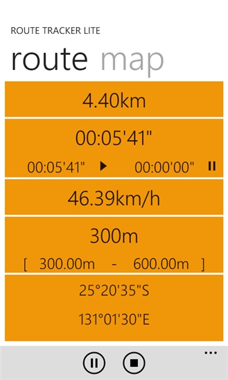
Screenshot of Route Tracker Lite display

Geo location data in txt. format and in xml. format. The latter is used to clean and organize data from the first.
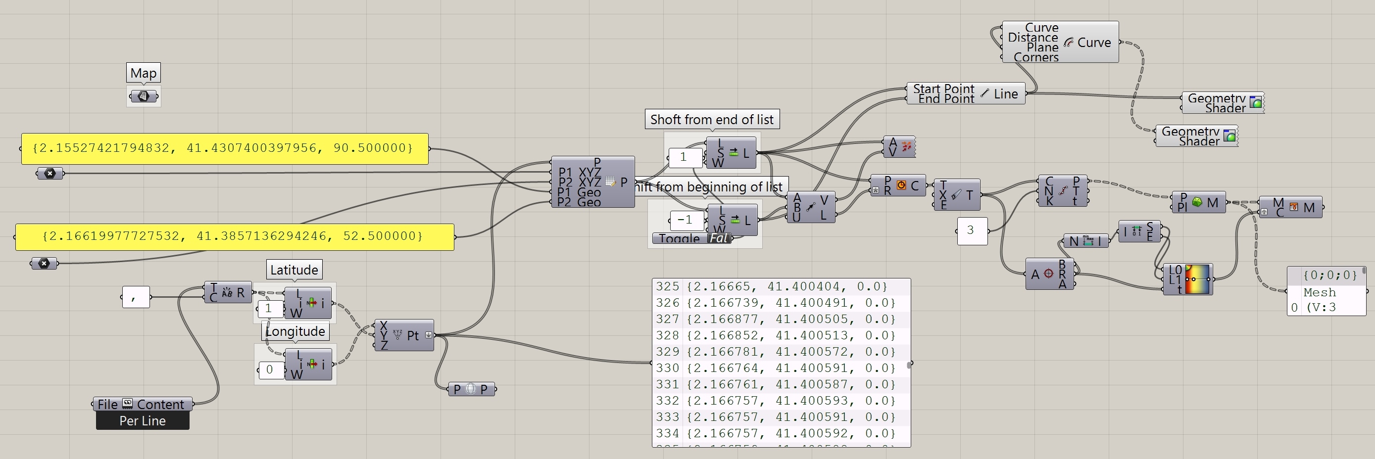
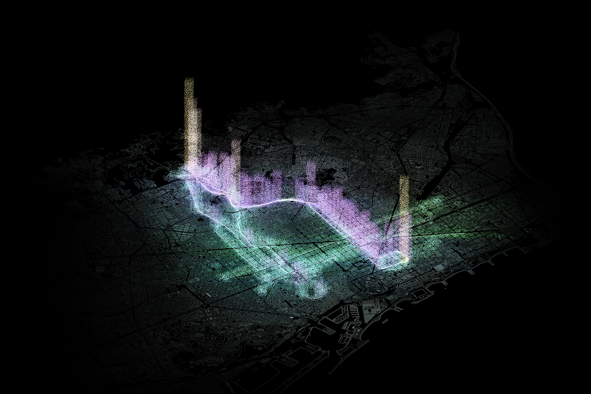
Through Grasshopper, coordinates are grouped in two shifted lists to connect every point with the following one in order to create the path.
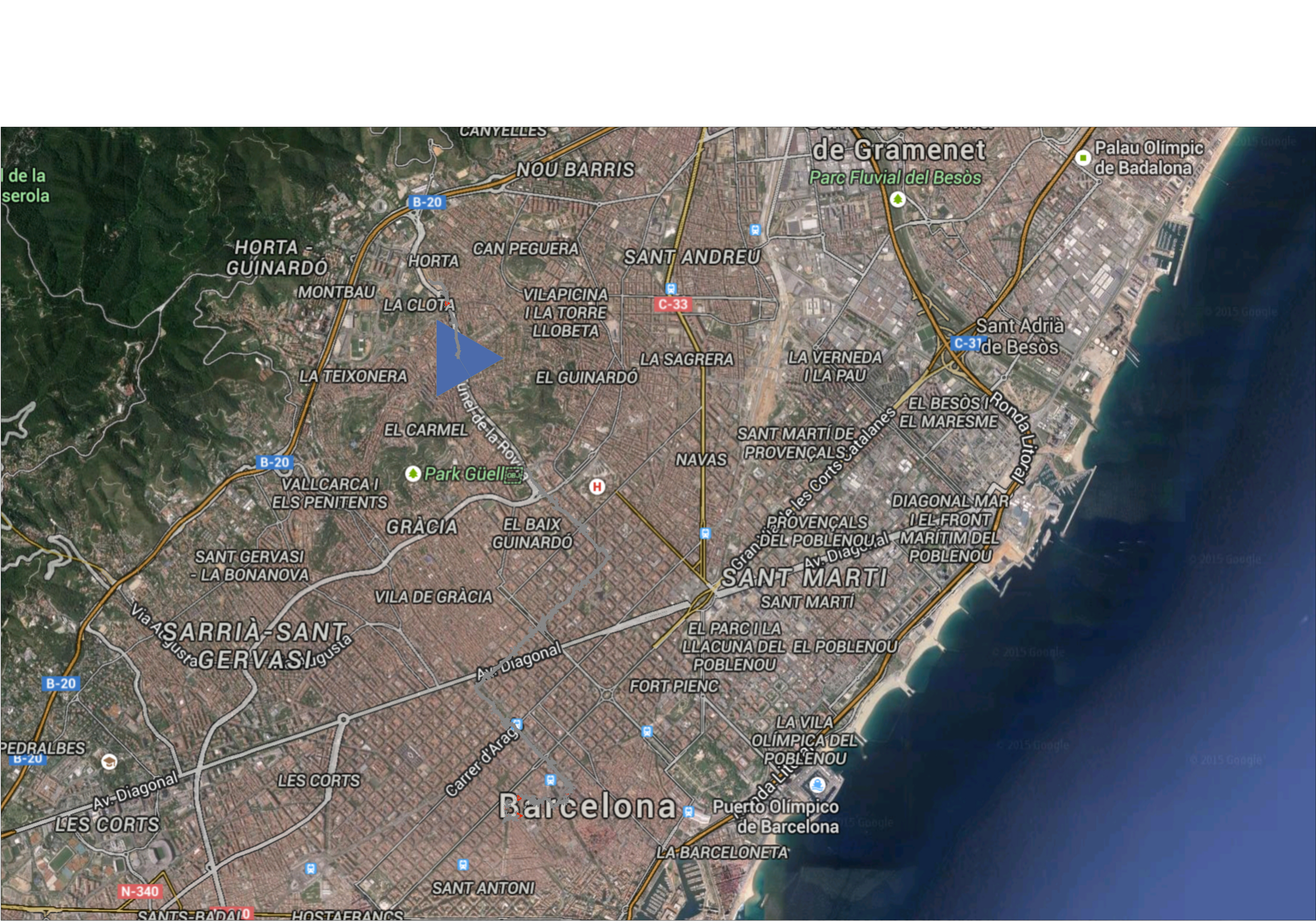
The map shows the grey path to reach the final point. At the end of every segment there is a triangle whose dimension is related to the length of the vector. In the image the most of these shapes are not visible due to the scale. The blue triangle shows how the tracking software had problems to measure the point because of a tunnel.
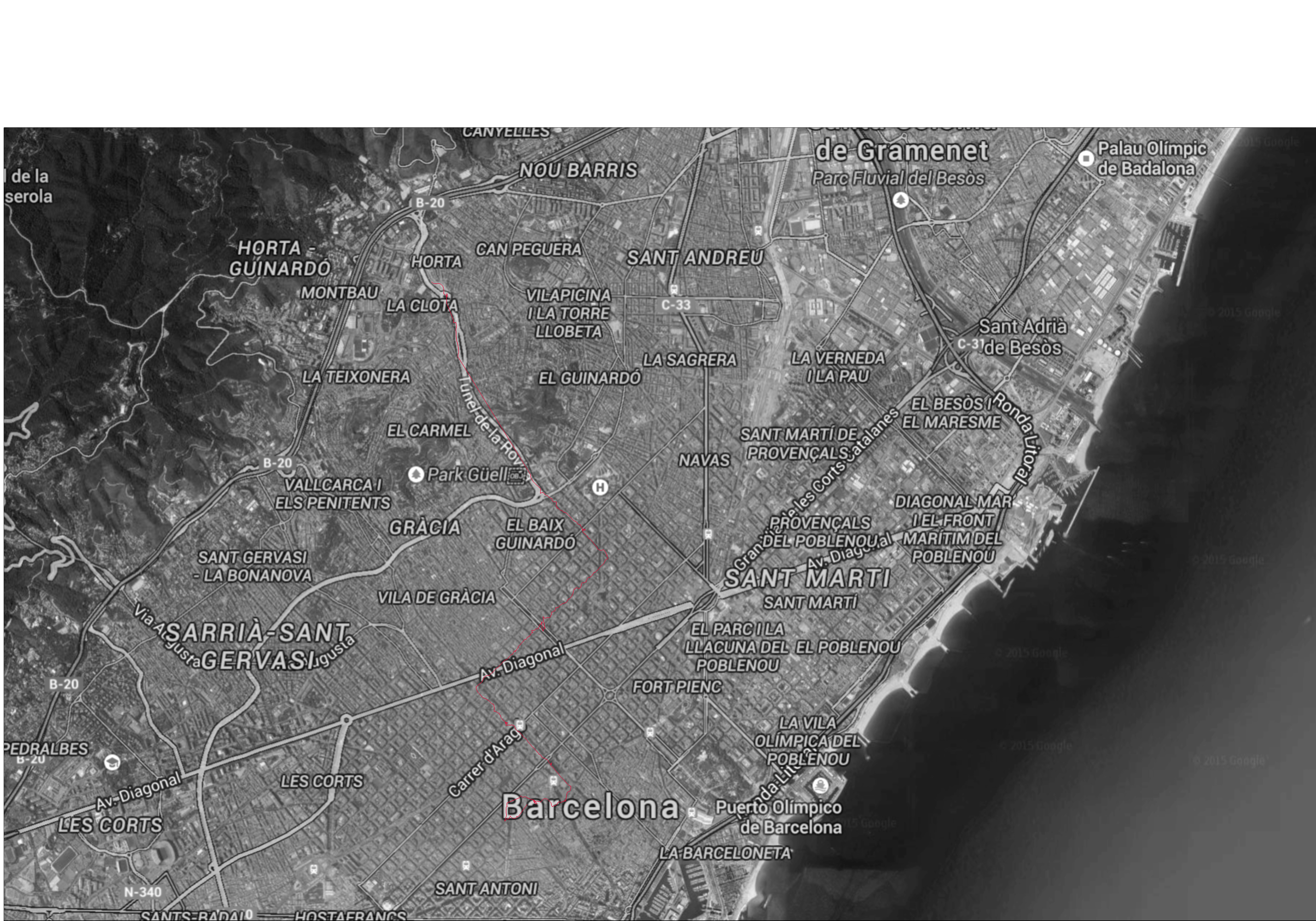
In this case the path is undermarked by a red line and the track is shown without any discontinuity point.
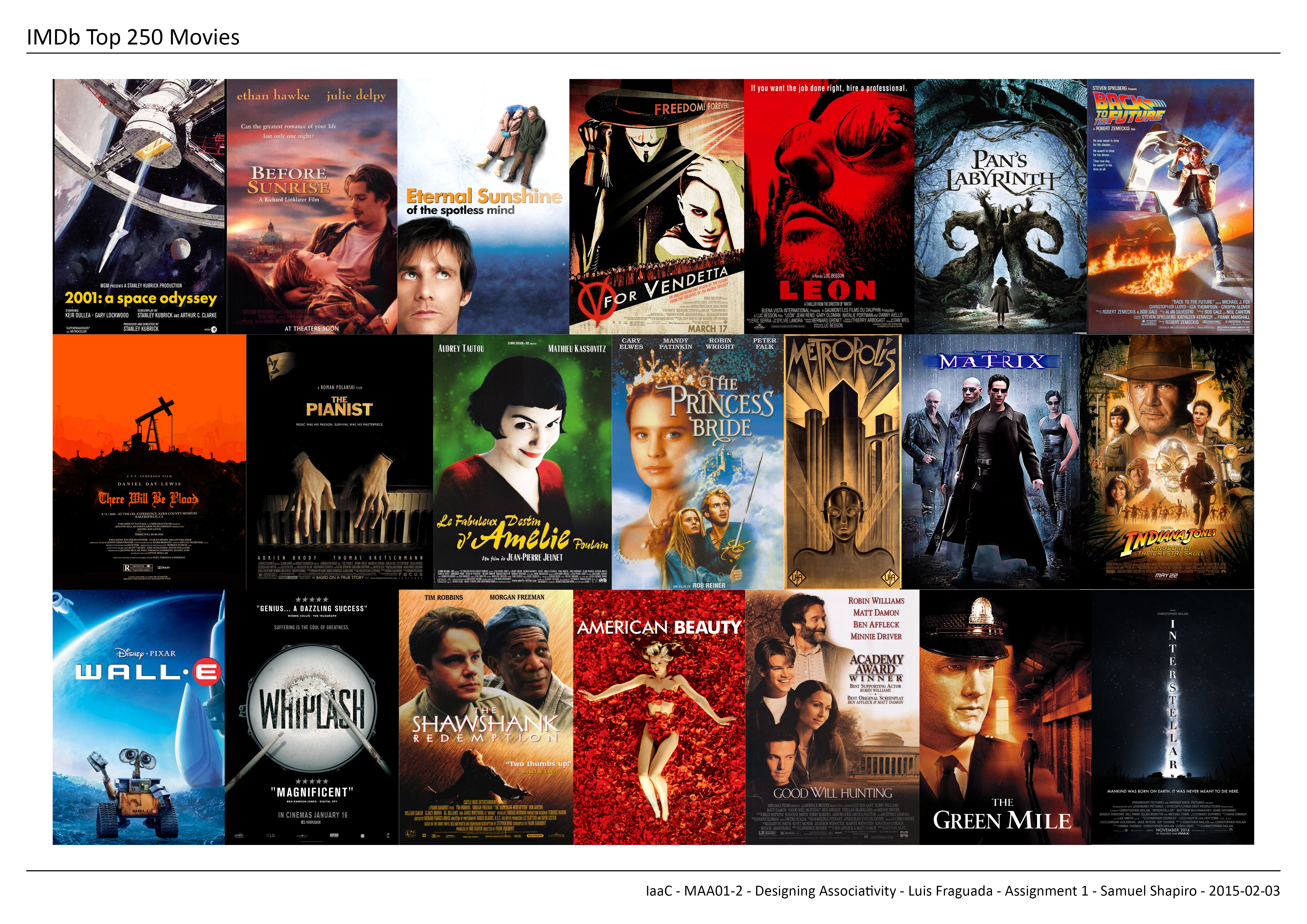
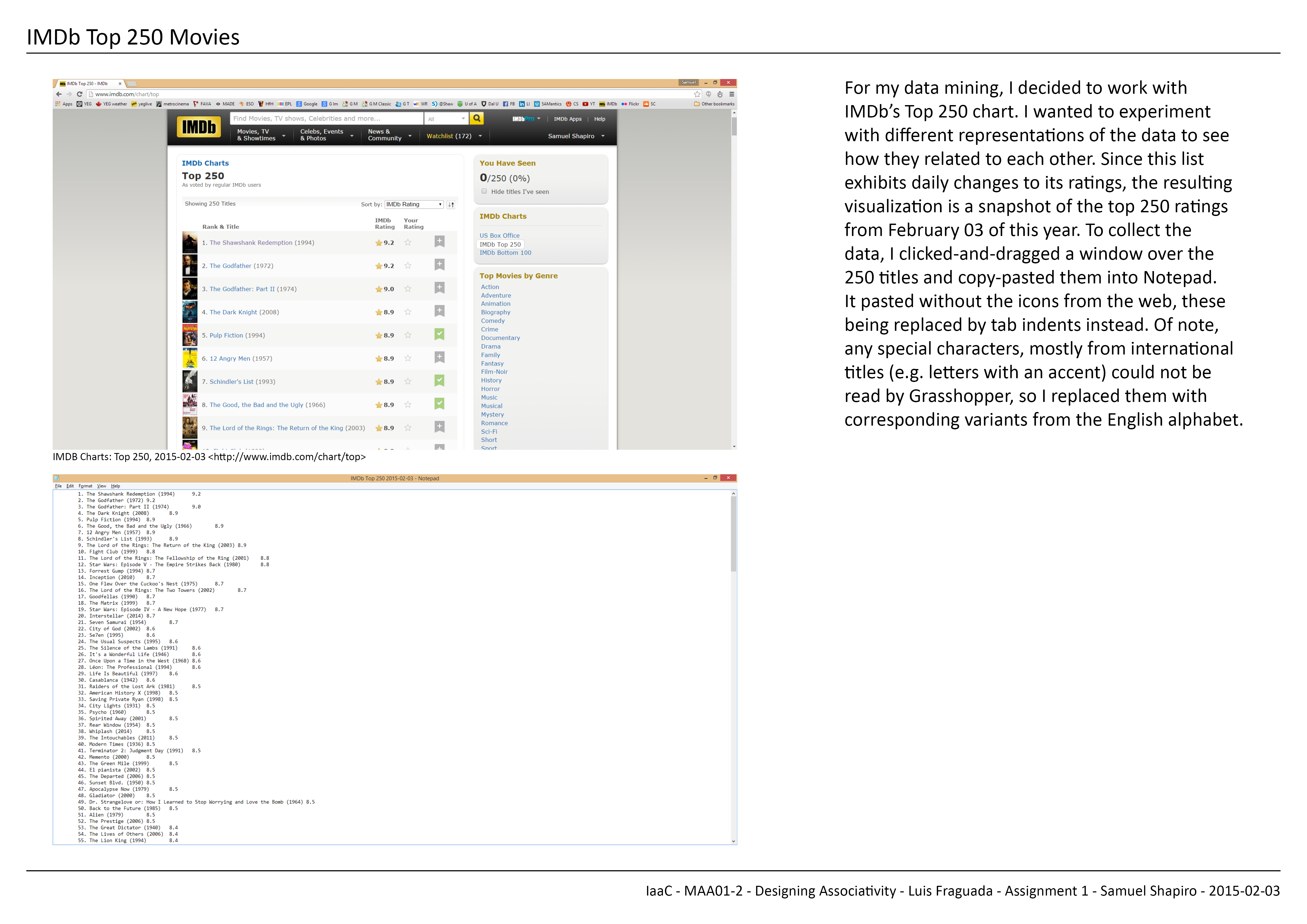
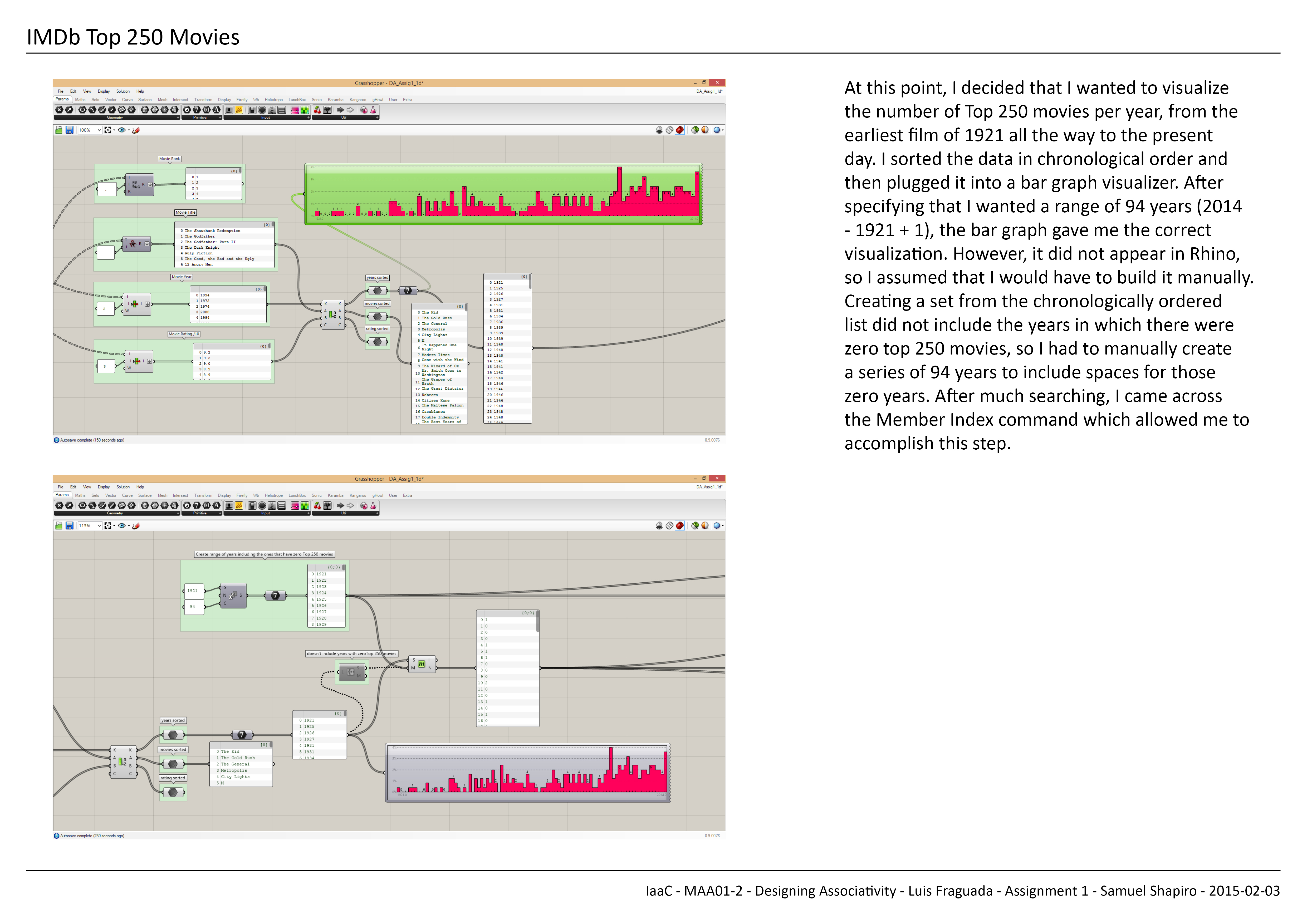
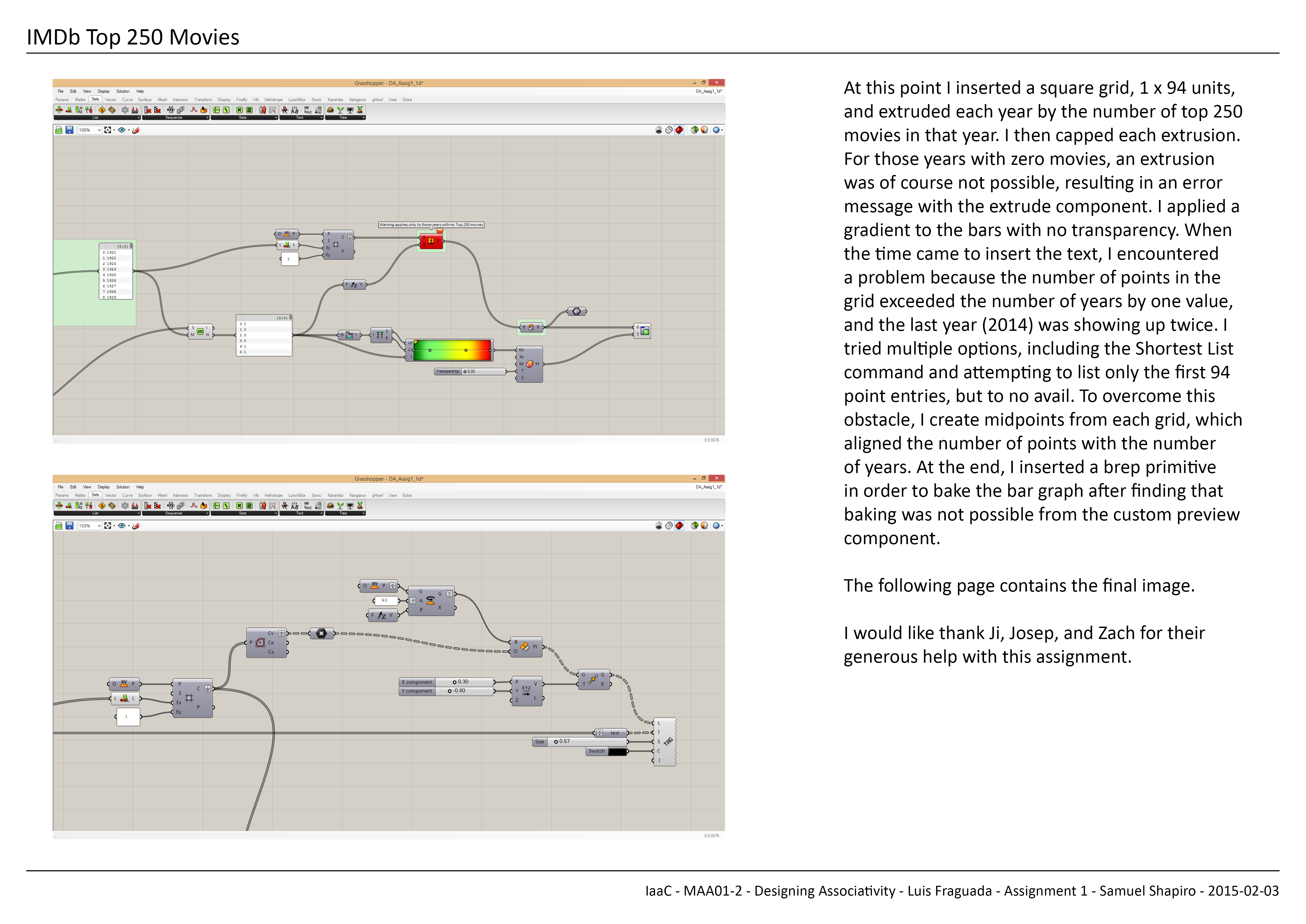
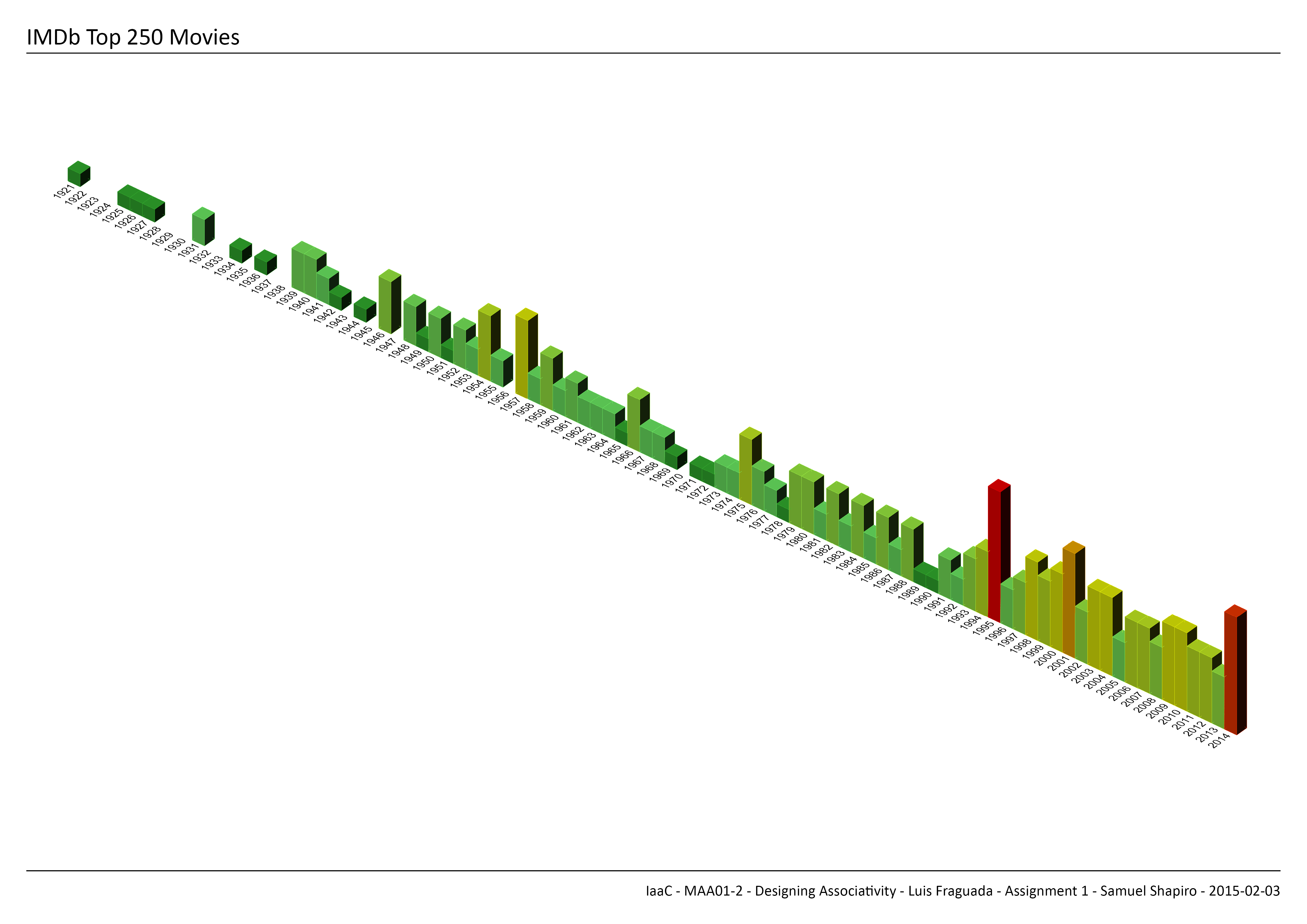
Designing Associativity_Assignment 1_Samuel Shapiro

Posted in Students Tagged Designing associativity, digital tools, Grasshopper, iaac, imdb, luis fraguada, movie, Rhino, samuel shapiro Comments closed
Designing Associativity_Visualizing Data
Data Visualizing
Group/ Deepti Dutt-Adhitya Rathinam-John Koshy
Data visualization is a general term that describes any effort to help people understand the significance of data by placing it in a visual context. Patterns, trends and correlations that might go undetected in text-based data can be exposed and recognized easier with data visualization software.
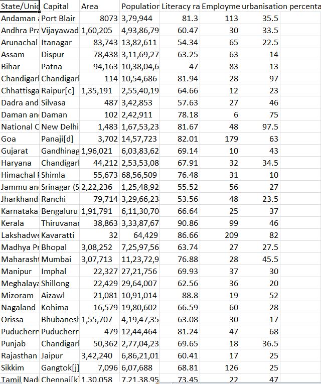
We have taken the statistical data of India in the year 2011 and concentrated on the aspects of Population, Employment , Literacy, Area and Capital.
The exported data is opened in MS Excel and we choose the parameters we want to project. Below is the statistical data of India in the year 2011.
Using the same structure of definition and by changing the slider , we get visualizations of different sets of data in terms of the capital,area,population literacy rate and employment rate.
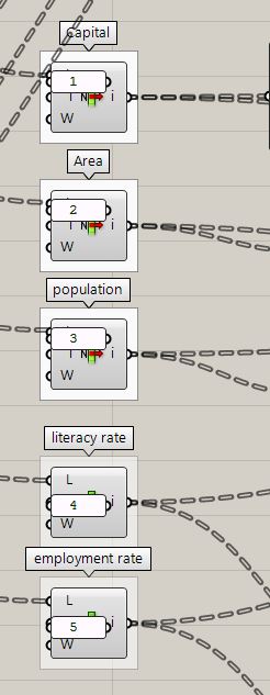


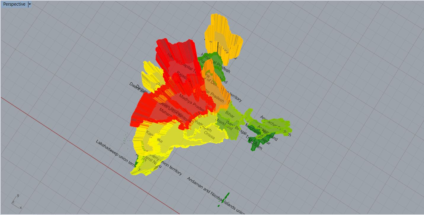
Illustration showing the states with maximum area:
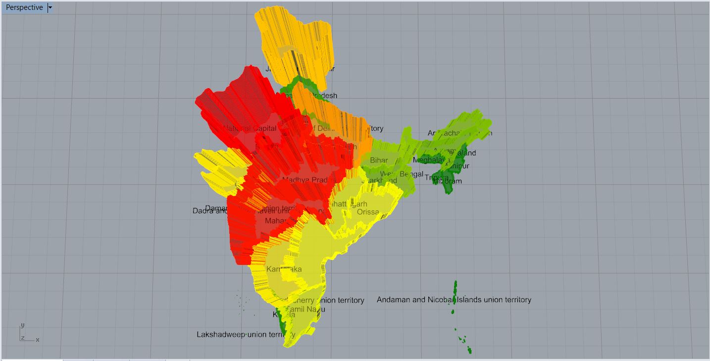

Illustration showing the state employment rates:
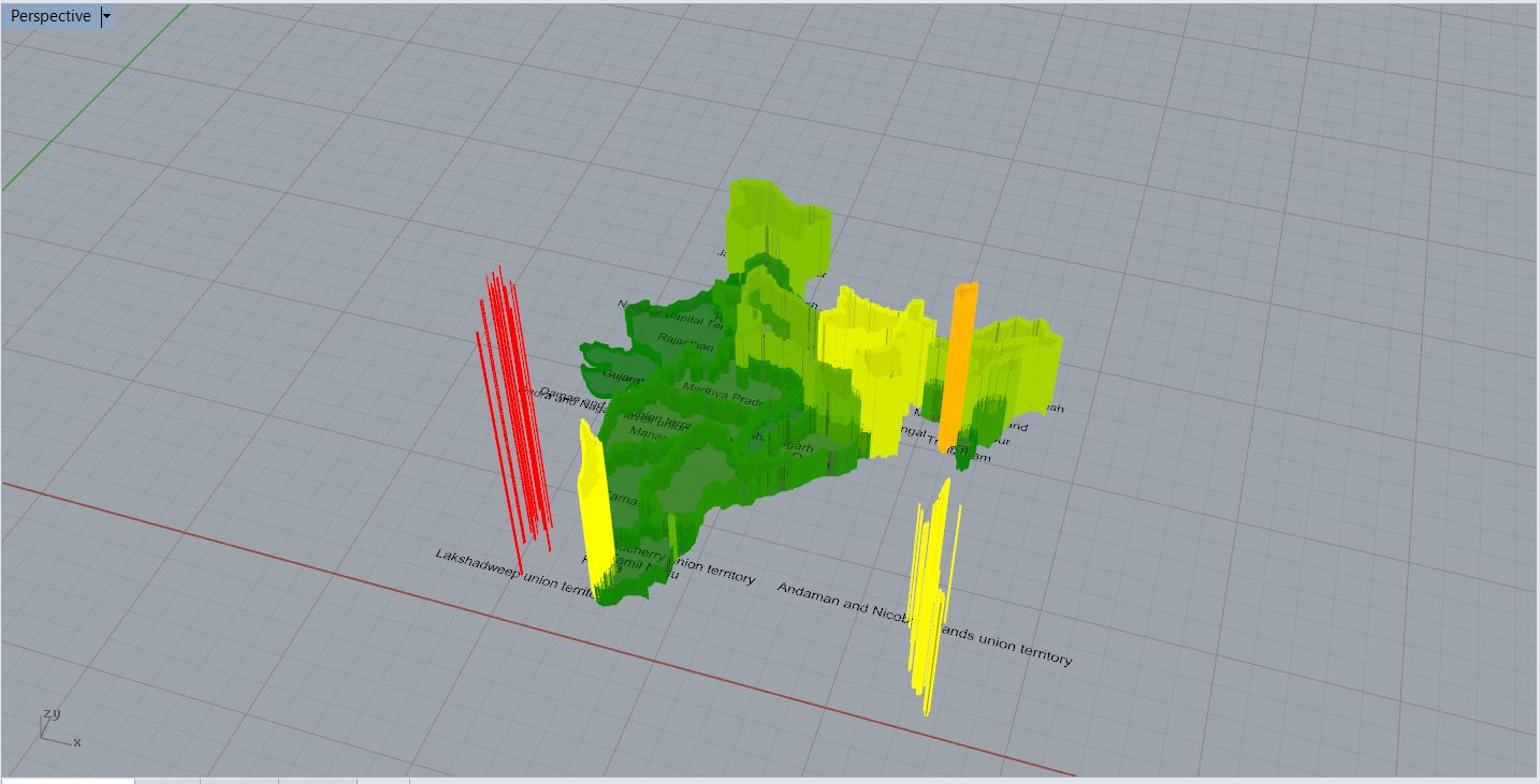
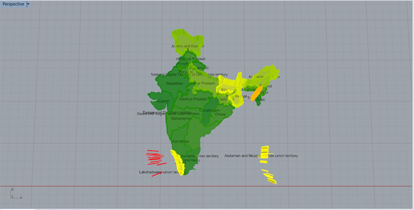
Illustration showing the literacy rates of the various states:
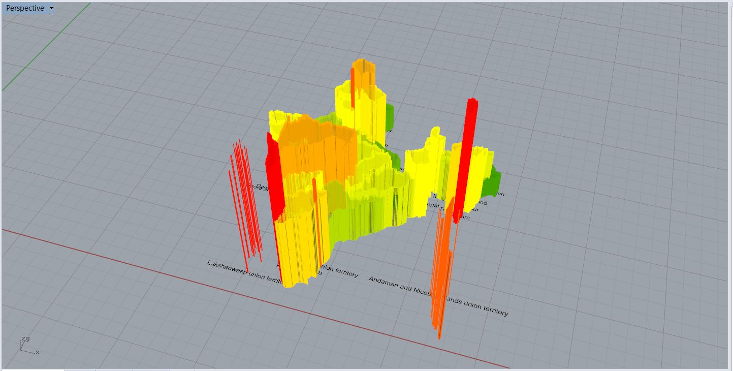
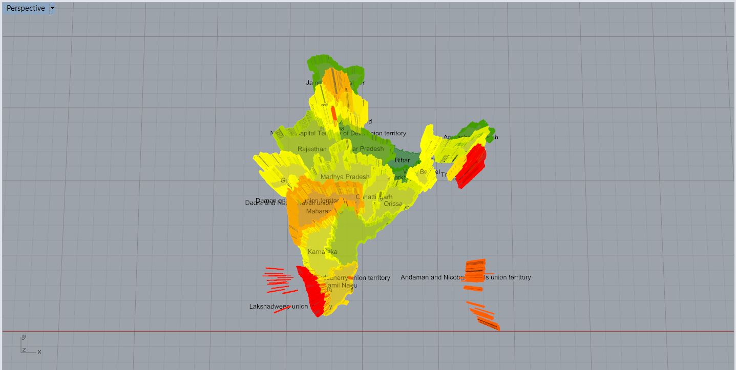
Illustration showing the population density of the various states:
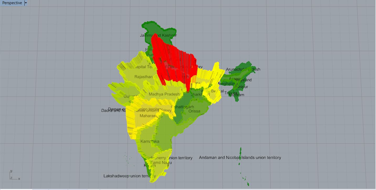
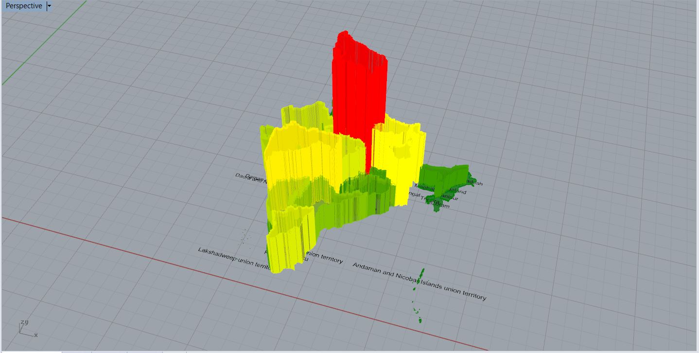
Illustration showing the amount of capital produced in each state:
Posted in Students Tagged adhitya rathinam, ASSIGNMENT 1, deepti dutt, Designing associativity Comments closed