Furqan and me worked on the ‘before the meeting phase’. We identified these issues:
- Schedule
- Organize / prepare
- Alert / Drive
- Setting up (putting up files, send files in advance,
The product
A tool for organizing and setting up a meetings.
-
Keep everything related and easy to understand like people, topics & contents.
-
Use an innovative semantic zoom to navigate between various contents.
-
levels: an overview of all meetings, a detailed view of each meeting, and finally down to the different topics and files that were discussed in a meeting.
First Demo
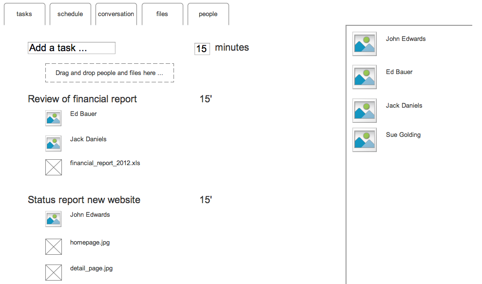
Our starting point was a wireframe that allowed people to look at information from different angles:
- Tasks: an overview of what had to be done during the meeting; the agenda if you will. Here’s where you add new tasks and set an optional time-limit for them. Files can be added by drag-and-dropping them onto tasks, and the same goes for people. The right sidebar has a smart listing of people. It knows who you’re regularly having meetings with, and gives these a high ranking. People you’ve recently exchanged email with also get a high ranking.
- Schedule: this is a screen to schedule a meeting. Here we were inspired by the Doodle like interface. The people invited for the meeting can indicate when they are available.
- Conversation: this would be a chronological overview of all communication on this project (email, chat messages, …). Some actions would also create messages automatically, for example “John has added financial_report.xls”, and people could comment on these.
- Files: an overview with all documents linked to this meeting.
- People: the same information as in the other views, but here we see everything from the point of view of the people involved.
After experimenting with this lo-fi wireframe, we decided to experiment with the metaphor of the table in a more high fidelity prototype. The idea was to move a bit away from the rigidness of the interface in the wireframe and see if the idea of the meeting table would make the application more useful.
So we prototyped in prezi which is a Platform using zooming as a navigation tool to make presentation. Here link to our prototype .
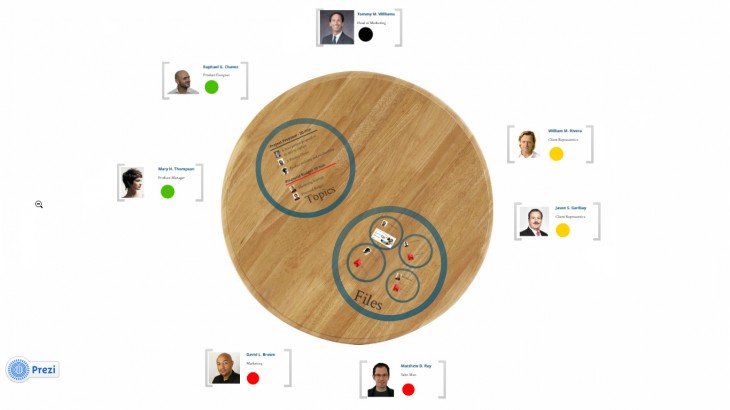
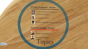
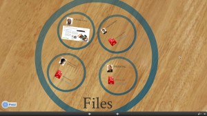
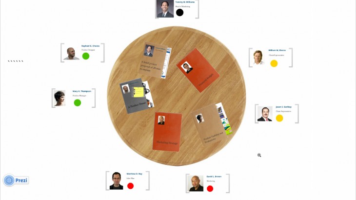
An overview of the table with Topics and Files marked as circles.
In this interface, the table is in the center with the people in the meeting surrounding it. Tasks, files, and other elements related to the meeting are on the table.
The interface is a prezi or jef Raskin’s idea of the Zoom World inspired. Which draws it’s straight from ZOOMING. So the our all contain is clear to you but by zooming in specific area you start getting more and more information about it.
So WHAT NEXT!!
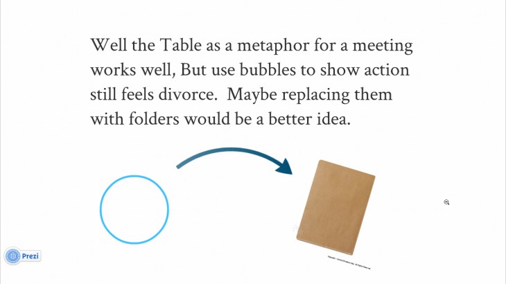
It would be nice the bring the experience closer to real world as possible.
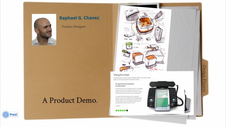
Using folders inset of circles gives it more closer to life appearance.
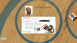
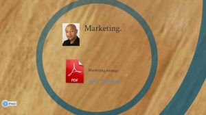
This is how it looks when you zoom on it.
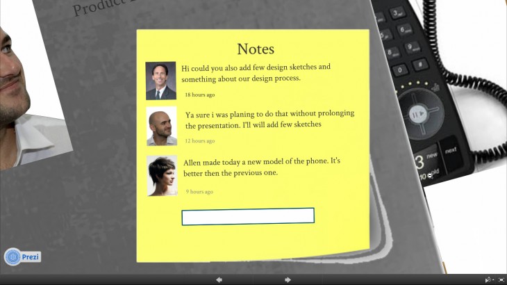
Many times before the meeting you would like to communicate few thoughts or remind your fellow works of something important. So in order to do that we used stick post. On stick posts you can posts and put reminder or comments.
So you select on the folder and just in real live case you will find all the contains that the person would present in the meeting
When you open the folder
Contain inside the folders
The next steps are:
- Exploring how far we get with this combination of skeuomorphism and zoom interface to navigate. We might have to use real life objects in some places.
- Since we rely on zooming, it wasn’t that easy to find a quick way to prototype this kind of interaction. We use Prezi, which was helpful but has its limitations. We should switch and explore other mediums like Flash or Processing to get a better feel of for how this works.
- Adding some functionality: eg setting reminders, notification, interface to setup.
