Vision, Ideas and Execution

Ok, today is recap day so here’s the summary.

The objective of this workshop was to help you navigate between this 3 different oceans (you know I like boats… so excuse my metaphor ;-) ): VISION, IDEAS, EXECUTION.

Vision: is about seeing the big picture. Identifying trends, changes in how people live, work, communicate, etc. It’s also about new things that technology will enable. Example: “Most employees will work from their mobile phone”. This is a vision.

Ideas: Most of the time ideas come from visions. But you can also have good ideas without any vision or “envisioning” skill. An idea is just a service, a tool or a physical space that doesn’t exist so far and may end-up existing. It’s an invention. Example: “A mobile app that will record a meeting activity and automatically create a summary for all participants”. This is an idea.

Execution: Is about putting visions and ideas to work. It’s about starting. It’s about prototyping, refining, building, testing. You get it…You don’t need examples here: just hands.

I’ve tried to prove you that:

1. Visions are important but they “expire”. You may have a vision today on how people will work in 5 years. It may be valuable today  but it won’t have any value in 5 years. At that time, if you were right your vision becomes an evidence (so no value). And if you were wrong your vision becomes absurd. So don’t focus only in visions because their value intrinsically diminishes.

2. Ideas are cool to have but we live in a world were there is definitely no ideas shortage. Even top venture capitalists are giving away ideas for free http://ycombinator.com/rfs.html . The idea guy doesn’t have a good reputation http://37signals.com/svn/posts/2188-theres-no-room-for-the-idea-guy . Plus you don’t really need an idea. If you don’t have an idea you can copy a good one. Yeah… I said COPY.

3. Execution is the only thing that really matters. It is the valuable part. It is what will make you end up not really copying but producing your own design (even if you started copying) . Investors only care about execution. Users only care about execution. While executing you’ll generate tons of fresh ideas. The only downside is that it takes time, effort, sweat, tears, focus and ultimately love.

So what are you executing with love today?

Posted in Future of Work | Comments closed

Before-The-Meeting

Furqan and me worked on the ‘before the meeting phase’. We identified these issues:

  1. Schedule
  2. Organize / prepare
  3. Alert / Drive
  4. Setting up (putting up files, send files in advance,

The product

A tool for organizing and setting up a meetings.

  • Keep everything related and easy to understand like people, topics & contents.

  • Use an innovative semantic zoom to navigate between various contents.

  • levels: an overview of all meetings, a detailed view of each meeting, and finally down to the different topics and files that were discussed in a meeting.

    First Demo

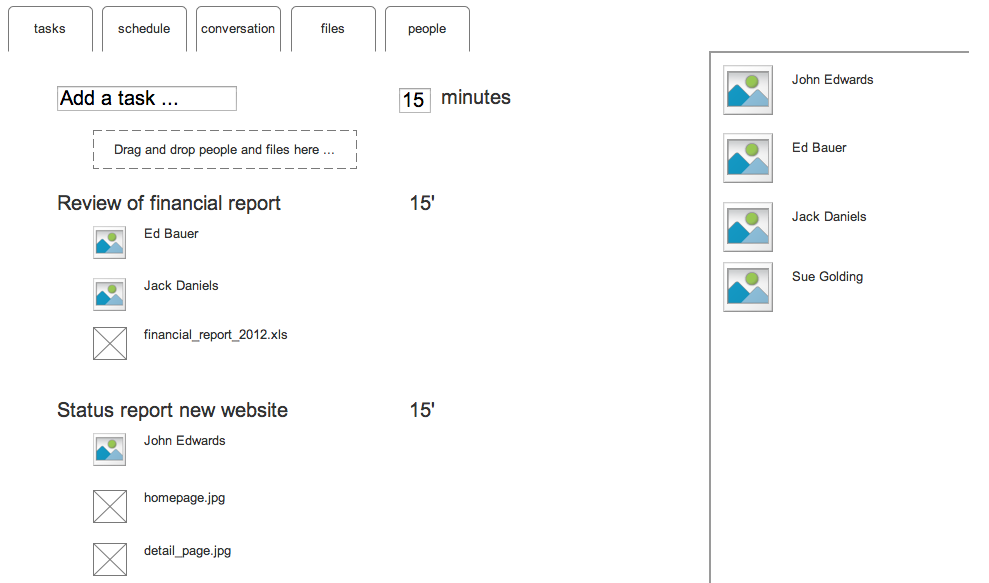
Our starting point was a wireframe that allowed people to look at information from different angles:

  1. Tasks: an overview of what had to be done during the meeting; the agenda if you will. Here’s where you add new tasks and set an optional time-limit for them. Files can be added by drag-and-dropping them onto tasks, and the same goes for people. The right sidebar has a smart listing of people. It knows who you’re regularly having meetings with, and gives these a high ranking. People you’ve recently exchanged email with also get a high ranking.
  2. Schedule: this is a screen to schedule a meeting. Here we were inspired by the Doodle like interface. The people invited for the meeting can indicate when they are available.
  3. Conversation: this would be a chronological overview of all communication on this project (email, chat messages, …). Some actions would also create messages automatically, for example “John has added financial_report.xls”, and people could comment on these.
  4. Files: an overview with all documents linked to this meeting.
  5. People: the same information as in the other views, but here we see everything from the point of view of the people involved.

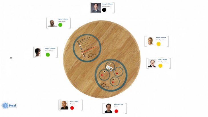
After experimenting with this lo-fi wireframe, we decided to experiment with the metaphor of the table in a more high fidelity prototype. The idea was to move a bit away from the rigidness of the interface in the wireframe and see if the idea of the meeting table would make the application more useful.

So we prototyped in prezi which is a Platform using zooming as a navigation tool to make presentation. Here link to our prototype .

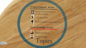
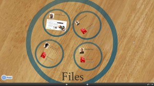
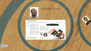
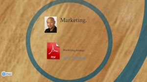
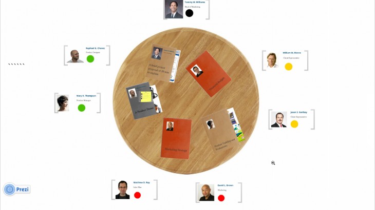
An overview of the table with Topics and Files marked as circles.

In this interface, the table is in the center with the people in the meeting surrounding it. Tasks, files, and other elements related to the meeting are on the table.

The interface is a prezi or jef Raskin’s idea of the Zoom World inspired. Which draws it’s straight from ZOOMING. So the our all contain is clear to you but by zooming in specific area you start getting more and more information about it.

So WHAT NEXT!!

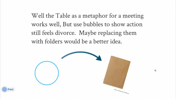
It would be nice the bring the experience closer to real world as possible.

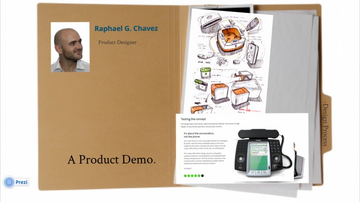
Using folders inset of circles gives it more closer to life appearance.

This is how it looks when you zoom on it.

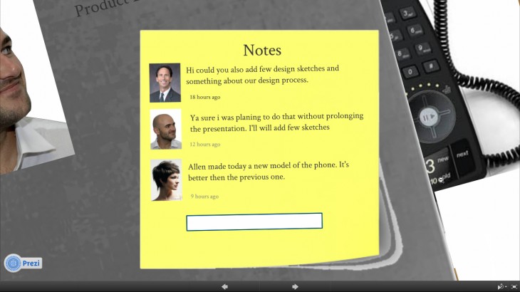
Many times before the meeting you would like to communicate few thoughts or remind your fellow works of something important. So in order to do that we used stick post. On stick posts you can posts and put reminder or comments.

So you select on the folder and just in real live case you will find all the contains that the person would present in the meeting

When you open the folder

Contain inside the folders

The next steps are:

  1. Exploring how far we get with this combination of skeuomorphism and zoom interface to navigate. We might have to use real life objects in some places.
  2. Since we rely on zooming, it wasn’t that easy to find a quick way to prototype this kind of interaction. We use Prezi, which was helpful but has its limitations. We should switch and explore other mediums like Flash or Processing to get a better feel of for how this works.
  3. Adding some  functionality: eg setting reminders, notification, interface to setup.
Posted in Bert Balcaen, Furqan Habib, Future of Work, Students | Comments closed

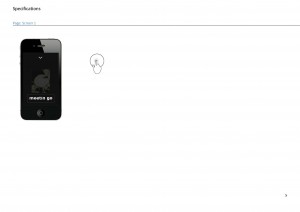
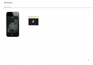
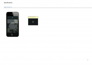
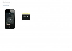
meety mockups

pre-meeting screen

Posted in Uncategorized | Comments closed

Oblong Mezzanine

Oblong Mezzanine from Oblong Industries on Vimeo.

Posted in Bert Balcaen, Students | Comments closed

The Feng Shui of Virtual Meeting Environments.

his was a keynote presentation at VRST 2000, the ACM Symposium on Virtual Reality Software & Technology on October 24, 2000 in Seoul, Korea.


Flow is a subtle but important feature of virtual worlds design. Flow or blockage of flow belongs to the aesthetic dimension of online virtual worlds. The study of flow goes beyond the usual dichotomies of user / tool, subject / object. Examples from the CyberForum series highlight four different aspects of flow in 3-D avatar worlds currently deployed for online learning and conferencing. The implications of flow suggest strategies for enhancing immersion in virtual worlds.
1. Introduction
Flow is a smooth, unimpeded movement through space-time. It is an aesthetic quality of spatial movement and occurs throughout the physical world. As conceived by Feng Shui (“Water and Wind” management), everything in the universe consists of subtle patterns of moving, flowing energy. Feng Shui sees the universe alive with yin-yang pulsations. Without flow, the universe would be dead. On micro and macro levels, energy currents continually balance and counter-balance one another. As a Taoist sage put it, “We may take things at the moment to be solid, but the universe is basically smoke and wind.”
Feng Shui is the art of arrangement, of placing things in such a way as to enhance the flow of energies and to minimize dissipation. Optimal flow for living organisms means that the atmosphere feels like a spring breeze — neither fast and vehement, nor sluggish and stagnant. The quality of flow causes living beings to either flourish or deteriorate. This paper argues that the art of placement applies to the design of virtual environments just as it applies to the arrangement of the physical world. Because space-time differs from the physical to the virtual, the art of placement is not identical in both realms but the two branches of Feng Shui share much in common. This paper explores four specific ways in which flow applies to the aesthetic of virtual environments.
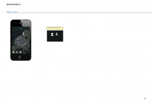
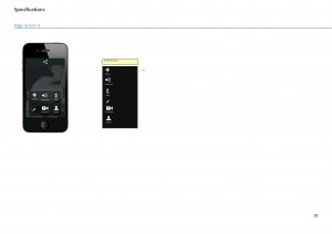
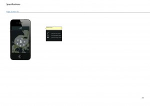
Prototype1_specifications_Página_02Prototype1_specifications_Página_05Prototype1_specifications_Página_06Prototype1_specifications_Página_07Prototype1_specifications_Página_08Prototype1_specifications_Página_09Prototype1_specifications_Página_10Prototype1_specifications_Página_10Prototype1_specifications_Página_11


Selected Bibliography

Anders, Peter (1998) Envisioning Cyberspace: Designing 3-D Electronic Spaces, McGraw-Hill Professional Publishing
Benedikt, Michael (1991). “Cyberspace: Some proposals”. In Benedikt, M. (Ed.). Cyberspace: First Steps (pp. 119-224). Cambridge, MA: MIT Press.
Heim, Michael (1993). The Metaphysics of Virtual Reality. Oxford: Oxford University Press.
Heim, Michael (1998). Virtual Realism. Oxford: Oxford University Press.
Jakobsson, Mikael and Fors, Anna Croon (2000). “Beyond Use and Design: The Dialectics of Being in Virtual Worlds,” presented at “Internet Research 1.0” September 9, 2000 in Kansas City, Missouri. Also available at: http://www.informatik.umu.se/nlrg/
Lunenfeld, Peter (1999). “Unfinished Business”. In Lunenfeld, Peter (Ed.). The DigitalDialectics. New Essays on New Media. Cambridge, MA: MIT Press.
Posted in Future of Work, Nazaret Cano | Comments closed