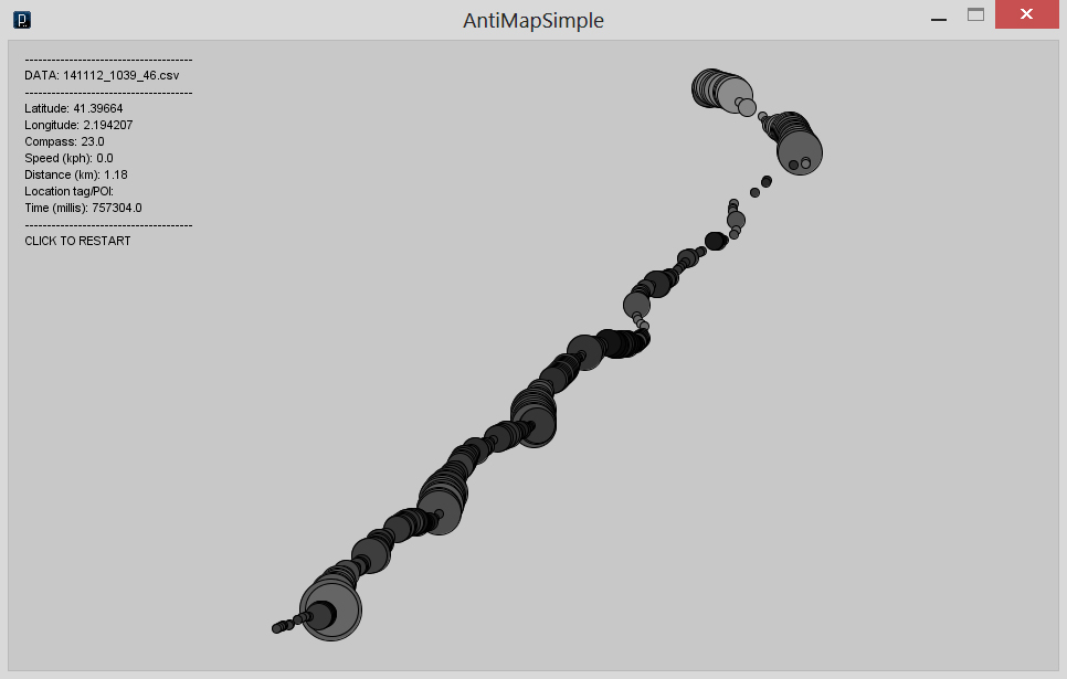
How does your movement look like?
The challenge was to find creative way to translate GPS data into visual form.
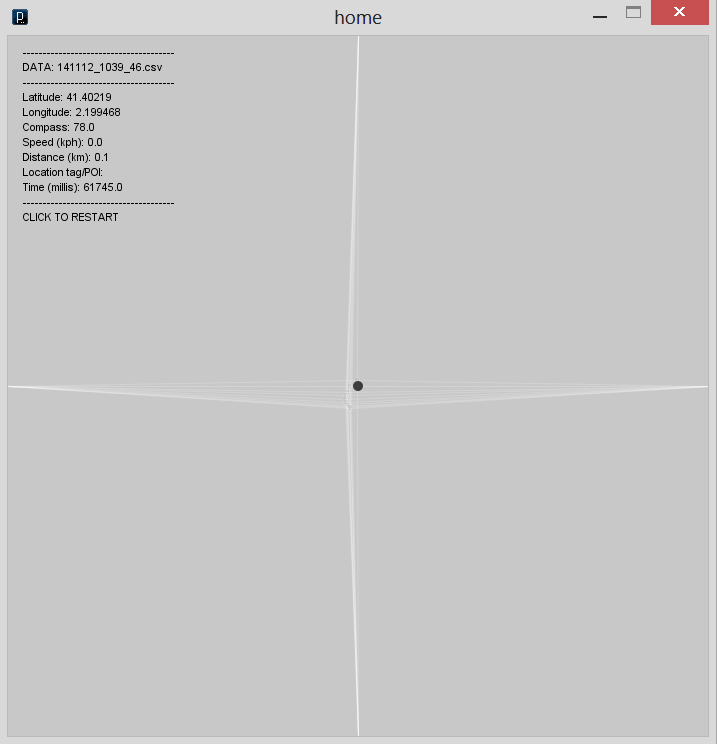
The idea is quite simple. What is home? Probably it’s your center of the world. Every journey starts and ends here. I picked my home as initial point and marked it as origin of the drawing. Movement is illustrated by stretching coordinate lines. In that case you can always see how far you are from initial point.
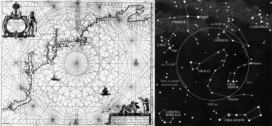
Nautical and celestial cartography, where relations between objects are clearly linked in simple and aesthetic manner were inspiring graphic forms:
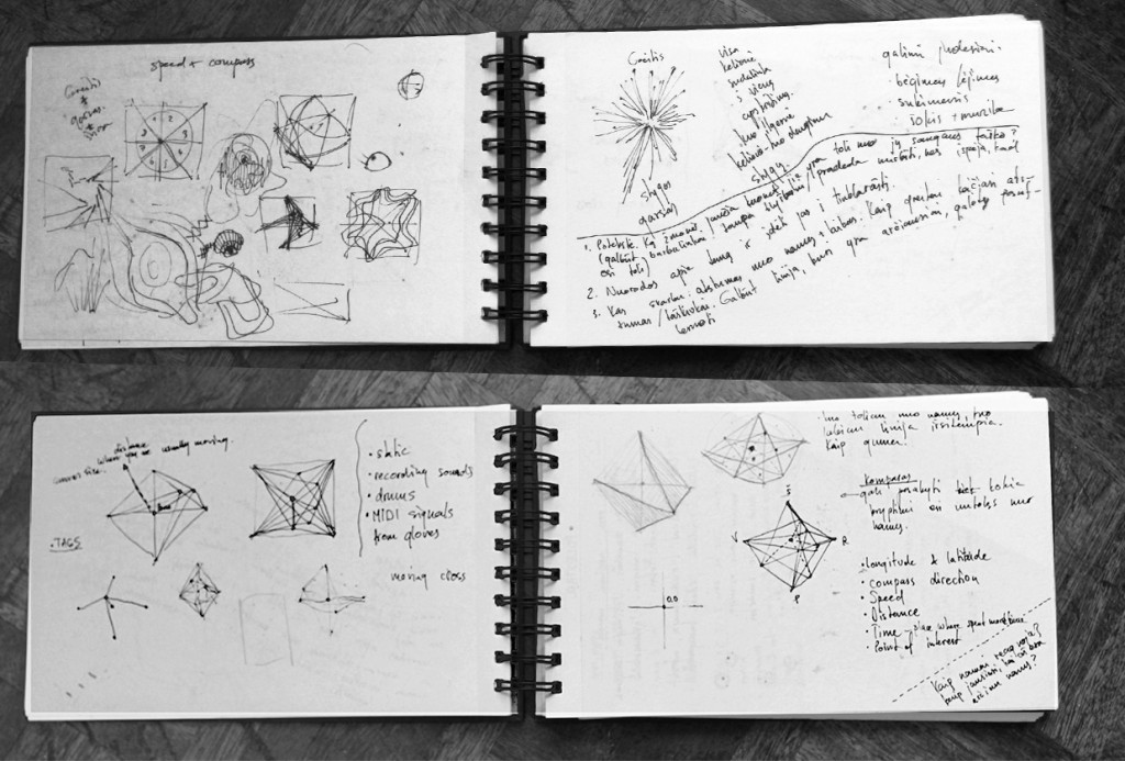
first concept sketches
and here’s how my interface sketch looks like.
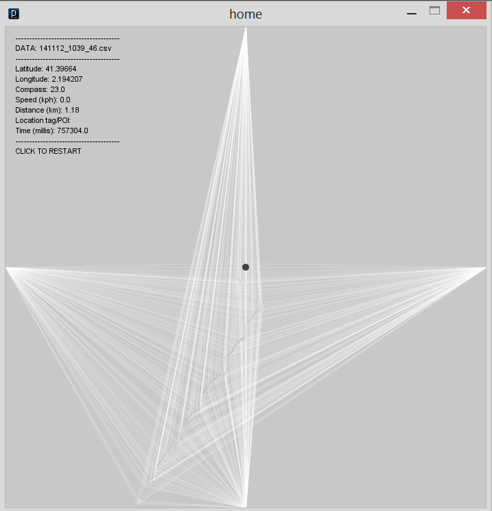
My first recording started from home to school. I used antiMap application, which gathered data about speed, distance, time, compass position, longitude and latitude. It was interesting experience to see this trip visualized. Somehow it looked like personal documentary cartoon. Here’s how my trip looked like:
Size of ellipse represents speed, color changes are compass position. Even there’s no information about streets, from speed and ellipse position you can clearly define where are crossroads with traffic lights. I never thought how my trip would look like. It shows how maps can be informative as well creative by invoking different tools.
In example you can see only one way trip, but tomorrow I will go to the beach and probably come back home :) It will help to complete my map.
