Assignment
Visualize GPS & compass data recorded with AntiMap.
Notes on using Antimap
I experimented a bit with the iPhone version of the app. It works well. Here are a few things that are good to know:
- The app should stay in the foreground. Don’t put your phone in stand by, don’t minimize the app, and don’t switch to another app. If you do this the recording will be stopped and there is no way to continue it. The CSV file is saved though, to in the theory you can start another session and somehow glue to the CSV’s together.
- Using GPS requires a lot of energy. Best to have a full charge if you want to record a long session.
- Rotation: I put it in the pocket of my shirt. It works well, but here is the trick: if you put in your pocket with the screen facing towards you, then the angle will be correct. If the screen is facing away from you you need to do 360 – the angle from the CSV to get the correct angle.
I made a quick and dirty sketch that visualizes the data on a map.
Idea: walking as a form of drawing that reveals the city
Inspiration: Michel de Certeau
De Certeau is a French philosopher and sociologist from the 1960s. For him, walking in the city is a creative act. It is not the city planners that make the city, it’s the people in it that bring it to life he says. Here is a a good summary on de Certeau.
Previous project: 35 days in NYC
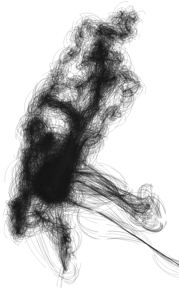
In a previous project I visualized 35 days of location data recorded with OpenPaths. I like it because it maps my experience of the city – which is different from someone else’s and the official city map. It shows my New York. I also like it visually: it’s organic, instead of the typical straight lines between points.
This assignment could be a nice way to revisit that project and to elaborate it. Maybe an animation can be interesting. Or maybe I should only show an animated part of the trail, instead of the everything at the same time. Also: the data I used was not continuous, because OpenPaths works in a strange way and only takes a snapshot every once in a while.
References

YesYesNo did a similar project for Nike+. Here the link between data and visualization very abstract. Maybe it’s nice to have it tighter?
Techniques
I will use a particle system that emits particles at the current location (lat/long). Speed could influence how it reacts with other particles. Fast: repel other particles. Slow: attract. Compass: direction. I recorded a couple of different styles of walks: one very functional (from home to IAAC), one while running, another one going home with some detours, … Could be nice to have them all together according to same algorithm, and hopefully see some interesting differences.
Feedback from Cristobal
- Use colors from a real map, giving people hints about the areas where GPS data was recorded. “You could use a colour palette that will be white (for streets), gray (for buildings) and green (for parks). I think it could be really easy to identify the visuals as an abstract representation of a map because we associate those colours to Google maps.” Great idea. I already have a basic Processing sketch that loads the GPS data and displays it on map. Shouldn’t be that hard to have it pick up the colors from the map and use these for the particles.
- “In this case, it would be awesome if the app grabs the POI along your path, affecting the visuals in a special manner. It also make sense what you mentioned about the speed at which you travel as a way to set how much you can enjoy the trip (going slow = getting more details of the city) versus a fast transportation.” I thought about this before, but it seemed to conflict a bit with the idea of “people create the city” and when I think about POI data, McDonalds and Starbucks are the first things that come to mind. But maybe I should just explore Foursquare & co a bit better, and see if there is a good way to filter out companies and administrative location and see what kind of data this gives. For example, the guys from the startup I used to work with had tagged the bench in the park next to our office.
Side note: on smartphones and GPS
