Progress on GPS visualization project for the data workshop, part 2

Visualization of GPS data, iteration 3 from Bert Balcaen on Vimeo.

In this video the color of the trail corresponds to its location on Google Maps. I spend a lot of time on this, but I think it’s adding a very interesting layer to the visualization. I’m using the Static Maps API from Google to download map images with a PHP script and then check the color of the pixel in the center. I turned off all text labels in the maps. Here’s an example:

I also decided that a little more context would be good, so I added the street names using reverse geocoding with OpenStreetMap. Example:

http://nominatim.openstreetmap.org/reverse?format=xml&lat=52.5487429714954&lon=-1.81602098644987&zoom=18&addressdetails=1&format=json

The data from the AntiMap app is very detailed. I got banned a couple of times because I was exceeding the rate limit of these API’s. Most of them allow only a certain amount of queries per hour. It also means the process of getting the street names and colors can take ages. For now I’m only doing this for a fraction of the data.

I’m experimenting with typography. Here I set the type in Futura Extra Bold Condensed. It’s a typeface from the same area where some of my inspiration comes from (the 1930s & the emergence of the flaneur).

I created the video’s by using saveFrame(“screenshot-######.png”) and ffmpeg:

ffmpeg -i screenshot-00%4d.png -vcodec libx264 test.avi

Posted in Uncategorized | Tagged | Comments closed

visualizing data. process

How does your movement look like?
The challenge was to find creative way to translate GPS data into visual form.

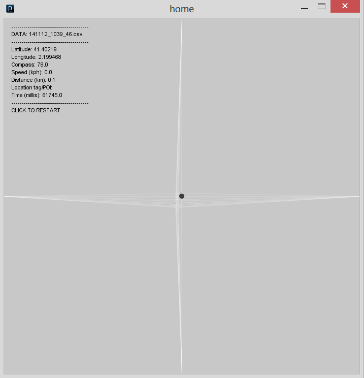
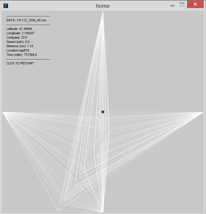
The idea is quite simple. What is home?  Probably it’s your center of the world. Every journey starts and ends here.  I picked  my home as initial point and marked it as origin of the drawing. Movement is illustrated by stretching coordinate lines. In that case you can always see how far you are from initial point.

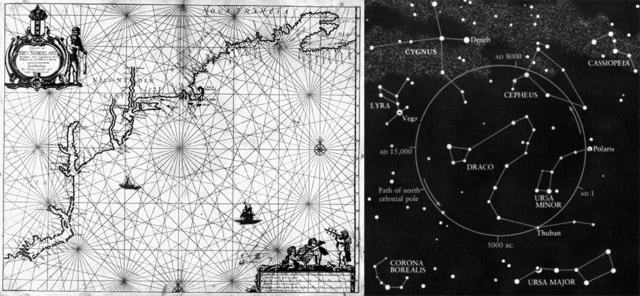
Nautical and celestial cartography, where relations between objects are clearly linked in simple and aesthetic manner were inspiring graphic forms:

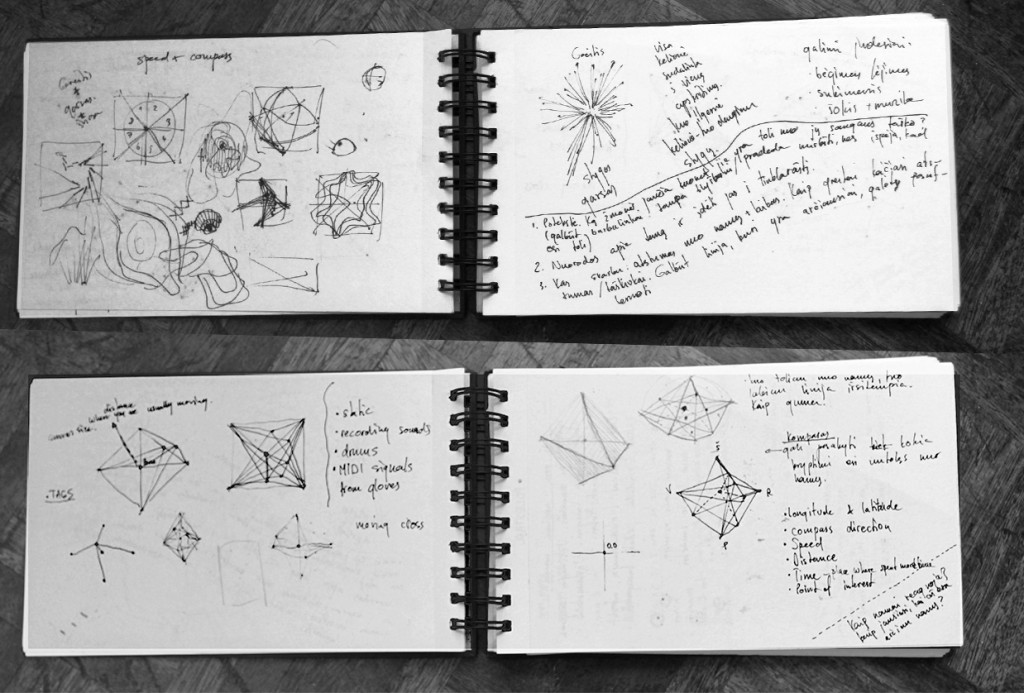
first concept sketches

and here’s how my interface sketch looks like.

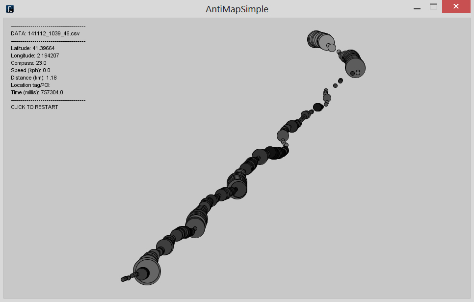
My first recording started from home to school. I used antiMap application, which gathered data about speed, distance, time, compass position, longitude and latitude. It was interesting experience to see this trip visualized. Somehow it looked like personal documentary cartoon. Here’s how my trip looked like:

Size of ellipse represents speed, color changes are compass position. Even there’s no information about streets, from speed and ellipse position you can clearly define where are crossroads with traffic lights. I never thought how my trip would look like. It shows how maps can be informative as well creative by invoking different tools.

In example you can see only one way trip, but tomorrow I will go to the beach and probably come back home :) It will help to complete my map.

Posted in Exercises, Gerda Antanaityte, Int Programming, References, Students | Tagged , , | Comments closed

Progress on GPS visualization project for the data workshop

See: data workshop

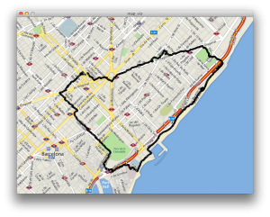
I wanted to get a feeling for the data so I started off by creating a quick and dirty Processing sketch that visualizes the location data recorded with AntiMap. I used Unfolding Maps, a very complete and well-made library for using maps inside Processing. Here is a screenshot.

That felt very static, and the core of my concept is how walking brings the city to life. I wanted to see how it would look like if I animated the trail, showing only a part of it. I also cleaned up the code a bit so it would be a bit easier to work with. This is the result:

Visualization of GPS data, iteration 1 from Bert Balcaen on Vimeo.

It draws a circle for each location. The circles grow and gradually become more transparent. It’s simple but interesting: it brings the data to life.

Cristobal suggested to use the map colors for the trail. I really like that idea, so I thought that would be a good next step. Here’s a video:

Visualization of GPS data, iteration 2 from Bert Balcaen on Vimeo.

However, at the moment I’m stuck on how to pick the right colors. The Unfolding library uses the GLGraphics for drawing maps, making the whole thing fast by using OpenGL. It also makes some basic things more complicated. For example: it seems that the get() function to find a color’s pixel doesn’t work as it should. I think some sort of offset is applied.

Posted in Bert Balcaen, Int Programming, Students, Workshop | Tagged | Comments closed

Visualizing skateboarding

Skataviz – Prototype from Design I/O on Vimeo.

iPhone tied to skateboard, records location and orientation. Custom software written in openFrameworks processes the data. It’s smart enough to detect tricks. I wonder how they managed to map the location data to the video.

Can be interesting for the data workshop.

Posted in Int Programming, References | Comments closed

Project plan GPS visualization project for the data workshop

Core of the idea

  • Walking brings the city alive. The piece will visualize data from walks and runs.
  • We all create our own version of the city. The visualization will not include a typical map – it will show how we create Barcelona with our walks. People watching the piece might be able to recognize neighbourhoods from the patterns generated by the walks.
  • I will focus on how walking is an act that exists only in the moment. The route will not be shown in its entirety.
  • The visualization of the location trail will use the standard map colors. This can help people to guess where to walker is, and will also reveal something about the qualities of the space used during the walk: main roads, sidewalks, buildings, parcs, …
  • Each GPS record is visualized as a line. Length is inversely related to speed. Short lines = fast. Long = slow. Direction of the line correspond to the compass.
  • Add basic info display with speed etc.

Phase 2: multiple routes

  • Check with running file, see if it’s different enough.

Phase 3: POI data

  • POI data is displayed along the route. The amount of POI’s displayed depends on the speed in a segment of a route. Slow sections have more POI’s.
  • POI’s popup with name when passing by, and disappear when moving further.
  • Data sources for POI’s: Foursquare.
  • Add street names to info display.
Posted in Bert Balcaen, Int Programming, Students, Workshop | Tagged | Comments closed