Category Archives: Uncategorized

Urban Capsules Project

0111ffff

The capsules project intends to insert in the the city of Barcelona a intalation that will interact with the people in the urban space.
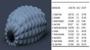
The Data were analyzed and implemented with the intention to find the difference in population density and create different patterns for the frame of this capsule.
Depending on the district in which this capsule is inserted its shape will change according with the density of this district.

02fffffffffffff

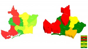
These maps show according to height, colors and names, the area of ​​each district of Barcelona.

fff033

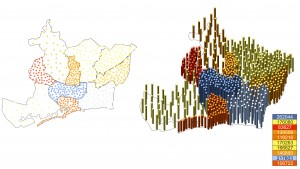
These maps show according to height, colors and names, the population of ​​each district of Barcelona.

Also posted in Giombattista Areddia, Renata de Castro Lotto | Comments closed

Earthquakes: Number of people affected and killed in relation to population density

Speculation

What is the relationship between the number of people killed or affected by earthquakes in comparison with the respective population density of worldwide countries?

Data Mining

The data we collected is composed of three branches:-

1. No. of people effected by earthquakes
http://www.emdat.be/database and http://www.cred.be/
link to data // https://spreadsheets.google.com/pub?key=rG_BjsDwyS2n7DANNH3i5vQ&gid=0
2. No. of people killed by earthquakes
http://www.emdat.be/database and http://www.cred.be/
link to data // https://spreadsheets.google.com/pub?key=rvbbs7uxQc7swJ4RR2BcQfA&gid=0
3. Population density per km squared
http://spreadsheets.google.com/pub?key=tVY51lNaCL9m9xPqf29oFAA&gid=0

Data Visualisation

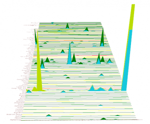
The data visualisation done through Grasshopper is a graphical representation that creates a comparison between the number of people effected by earthquakes and the number of people killed by earthquakes on a yearly basis. The population density is also taken into account in order to understand better if this relates to the number of people effected/killed.

The number of people effected, number of people killed and population density are represented with green, blue and yellow respectively. The bottom part of graph is the number of affected people whilst the top is the number of killed people.

This kind of graphical representation can be used further for our design studio to see differences between population densities and other social factors happening at the same time.
1

Also posted in Pablo Miguel Marcet Pokorny | Comments closed

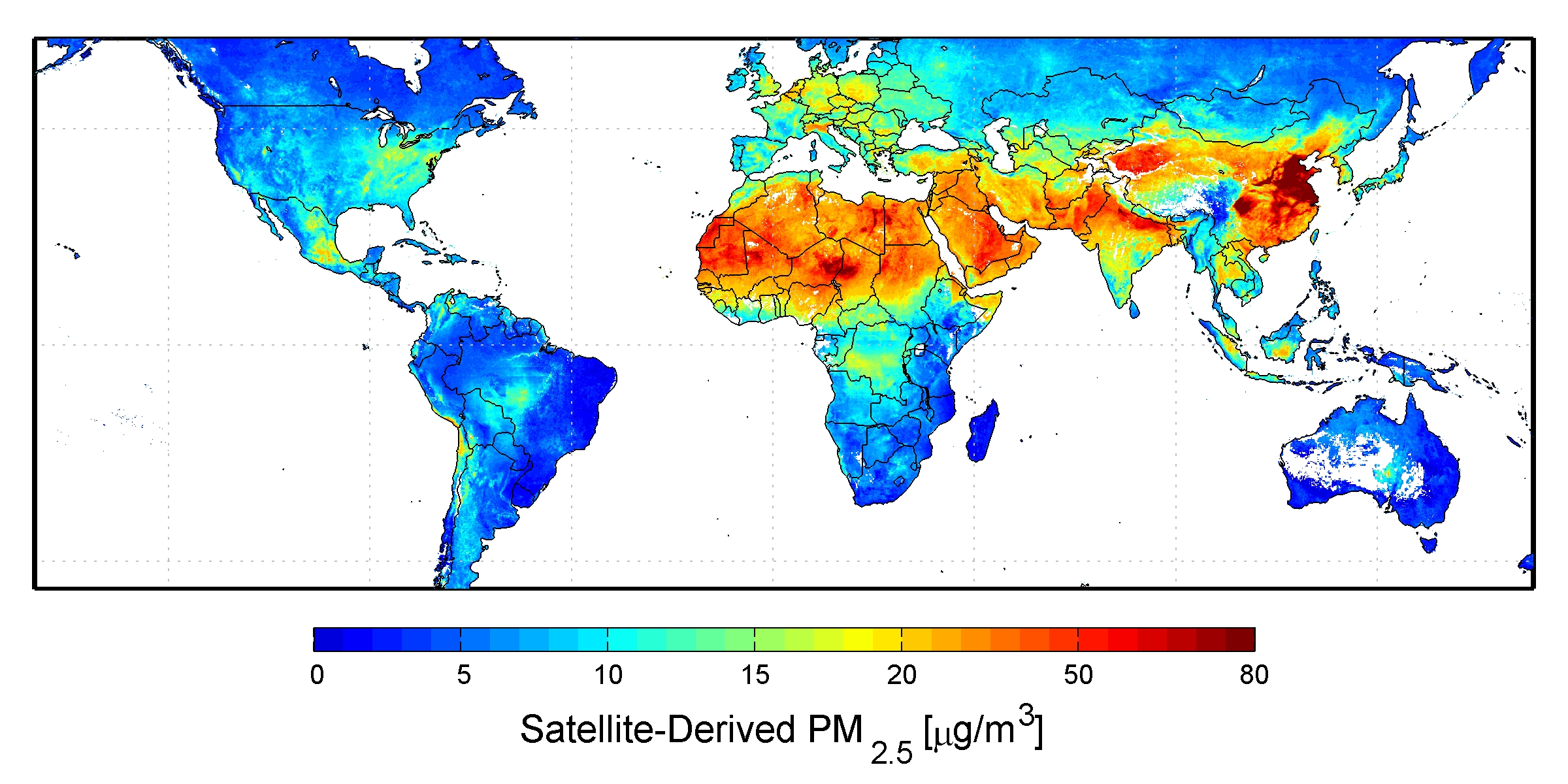
AIR POLLUTION IN BARCELONA

MATLAB Handle Graphics

Air pollution is the introduction of chemicals, particulates, biological materials, or other harmful materials into the earth’s atmosphere, posibly causing disease, death to human, damage to other living organisms such as food crops,or the natual or built enviroment.

Stratospheric ozone depletion due to air pollution has long been recognized as a threath to human health as well asto the earth’s ecosystems. Indoor air pollution and urban air quality are listed as two of the world’s worst toxic pollution problems in the 2008 Blacksmith Institute World’s worst polluted places report. Read More »

Posted in Uncategorized | Comments closed

[Designing Associativity 2014] Kovachev Hristo


The Data collected and mapped is unfortunately not connected to any of my projects at the time, having in mind that all are far away from real architecture and functions for now.
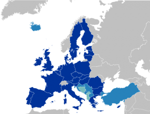
So being a European from a country (Bulgaria) that just has recently joined the Union, I decided to pick a topic related with the other candidates applying for membership.

680px-EU27-candidate_countries_map.svg

Reference links:
http://commons.wikimedia.org/wiki/File:EU27-candidate_countries_map.svg Read More »

Also posted in Hristo Kovachev | Comments closed

Climate Based ArchitectureTransfer

Speculation

Climate and location are fundamental for architecture design. Beyond the cultural, religious, historical differences between different human groups, we all share common needs for food, clean air and water, socialization and a healthy habitat.

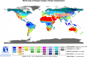
Plants have adapted to different climates all over the Earth’s surface, in a way that architecture can assimilate for itself. The Köppen–Geiger climate classification map is based on the concept that native vegetation is the best expression of climate. Thus, climate zone boundaries have been selected with vegetation distribution in mind. It combines average annual and monthly temperatures and precipitation, and the seasonality of precipitation. -Wikipedia.
Koppen_World_Map_(retouched_version)

The Köppen–Geiger climate classification map. Wikipedia.

Architecture is meant for the human wellbeing, improving the relation between people and their environment.

This project analyzes the idea that architecture can be theorized in a way that it can adapt to similar climates, in different places of the planet.

Can architecture develop a style for a specific climate that can adapt to different locations, in the same way that plants do?
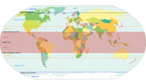
World_map_indicating_tropics_and_subtropics

The classic division for climate regions of the planet. Wikipedia.


Data Mining

Data =  population → arranged according to the The Köppen–Geiger climate map in the tropical zones of the planet.

The Köppen–Geiger climate map is crossed with the location and population of the main cities for each climate. In this way, it can be graphically appreciated where is the most important architecture development for each climate, and hopefully, the best adaptation to climate. The different architectures that share the same climate can transfer and share their knowledge to develop better architectural solutions adapted to the climatological reality of each region.


Tropical zone on the planet

According to the The Köppen–Geiger climate map, there are three climate zones inside the tropical zone of the planet:

AF – tropical rainforest climate.

AM – Tropical monsoon climate.

AW – Tropical savanna climate.
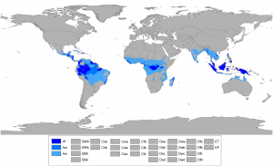
 

Koppen_World_Map_Af_Am_Aw

Tropical climate zones of the Earth where all twelve months have mean temperatures above 18 °C. Wikipedia.


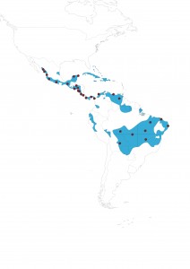
The zone of interest for this analysis is focused on the Tropical savanna climate. The analysis will show which one is the major architectural development at one specific climate, by mapping the main cities of the Tropical savanna climate. The population of each city will be used as DATA to graphically show the development of each city, under the speculation that the more population, the best and more adapted solution of buildings for climate.


The chosen cities and regions, that share this same climate, are:

City/Region – COUNTRY

Population

Culiacan MEXICO.

733,37

Mazatlan MEXICO.

438,434

Tepic MEXICO.

380,249

Colima MEXICO

950,555

Chilpancingo MEXICO

187,251

Tuxtla Gutierrez MEXICO

553,374

Merida MEXICO

777,615

Cancun MEXICO

628,306

San Salvador EL SALVADOR

 1,860,000

San Pedro Sula HONDURAS

1,200,000

Tegucigalpa HONDURAS

 1,126,534

Leon NICARAGUA

389,6

Managua NICARAGUA

 2,132,421

Liberia COSTA RICA

53,381

San Jose COSTA RICA

 2,600,000

David PANAMA

144,858

CiudaddePanama PANAMA

 1,206,792

Pinogana PANAMA

13,85

Cartagena COLOMBIA

 1,239,430

Caracas VENEZUELA

 8,460,591

CiudadBolivar VENEZUELA

342,28

Rondonia BRASIL

 1,562,409

MatoGrosso BRASIL

 3,115,336

Tocantins BRASIL

 1,157,690

Maranhao BRASIL

 6,714,314

Brasilia BRASIL

 2,562,963

Fortaleza BRASIL

 2,515,116

Recife BRASIL

 3,871,000

Santa Cruzdela Sierra BRASIL

 2,102,998


Data Visualization

 Tropical Savanna Climate -- Cities


Image generated using Rhinoceros and Grass Hopper, crossing the data as described above.

Also posted in Sebastian Alvarado Grugiel | Tagged , , , | Comments closed