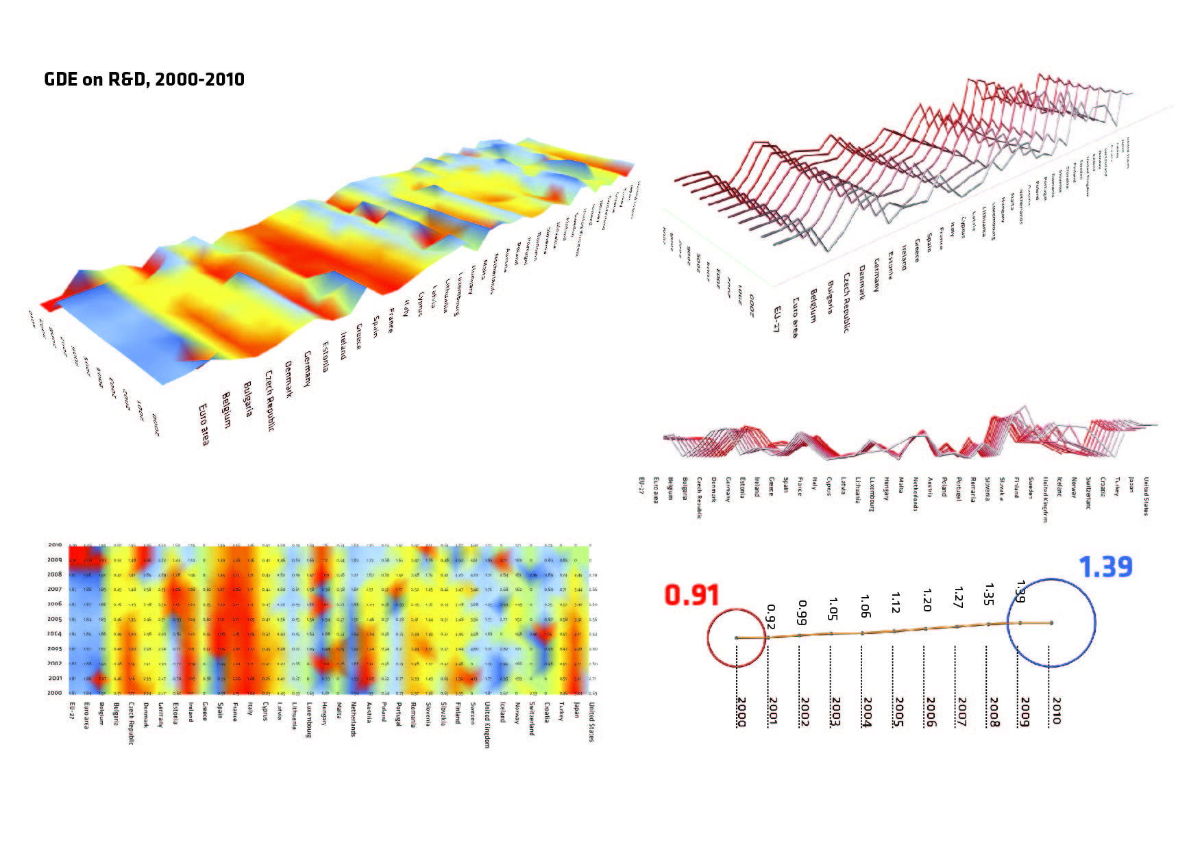
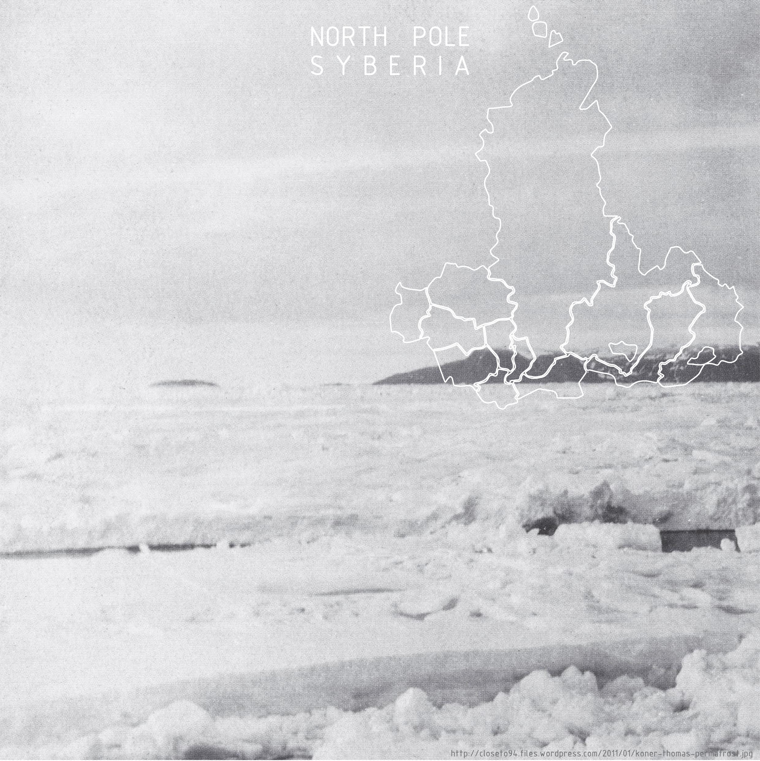
The investigated issue is tackling one of the research areas for this semester’s Self Sufficient Studio design project- methane emission, one of the most dangerous greenhouse gases.
The subject of the study is Siberia because I believe it to provide an extreme phenomena of methane emission due to the permafrost.
The investigated region is precisely Siberian Federal Districts, consisting of 12 Federal Subjects, each one being a representative unit for the data measurement.
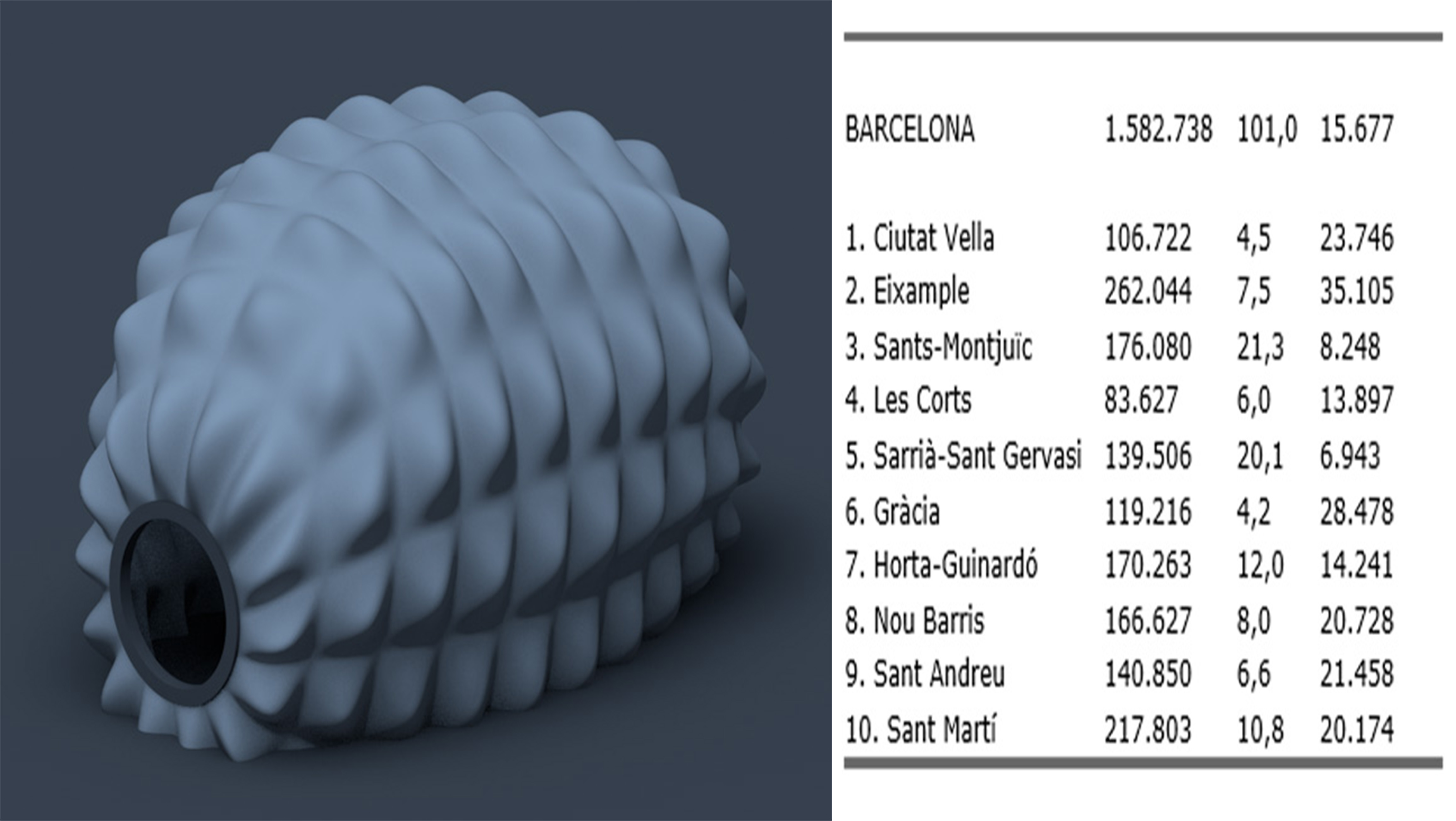
The capsules project intends to insert in the the city of Barcelona a intalation that will interact with the people in the urban space.
The Data were analyzed and implemented with the intention to find the difference in population density and create different patterns for the frame of this capsule.
Depending on the district in which this capsule is inserted its shape will change according with the density of this district.
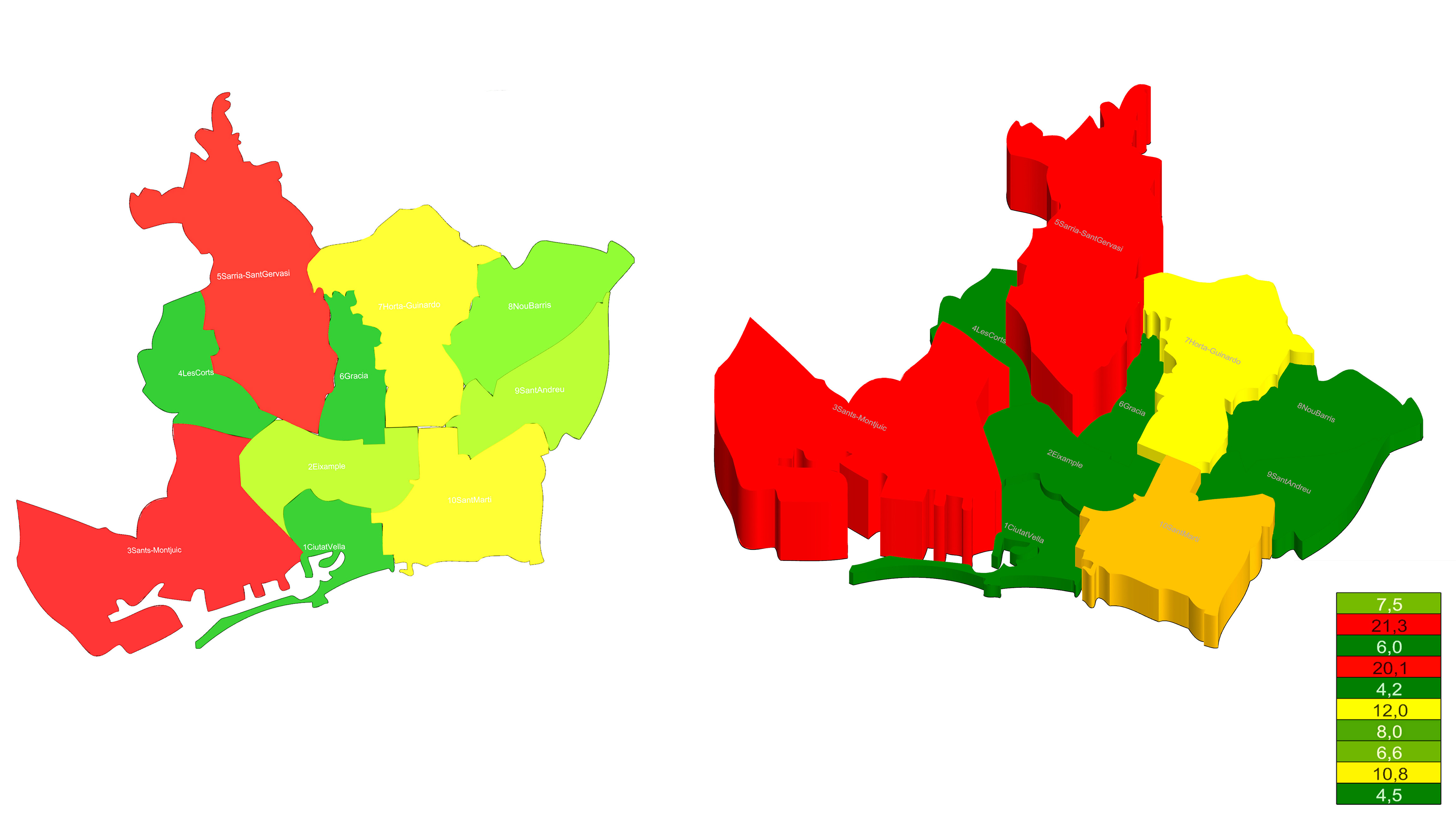
These maps show according to height, colors and names, the area of each district of Barcelona.
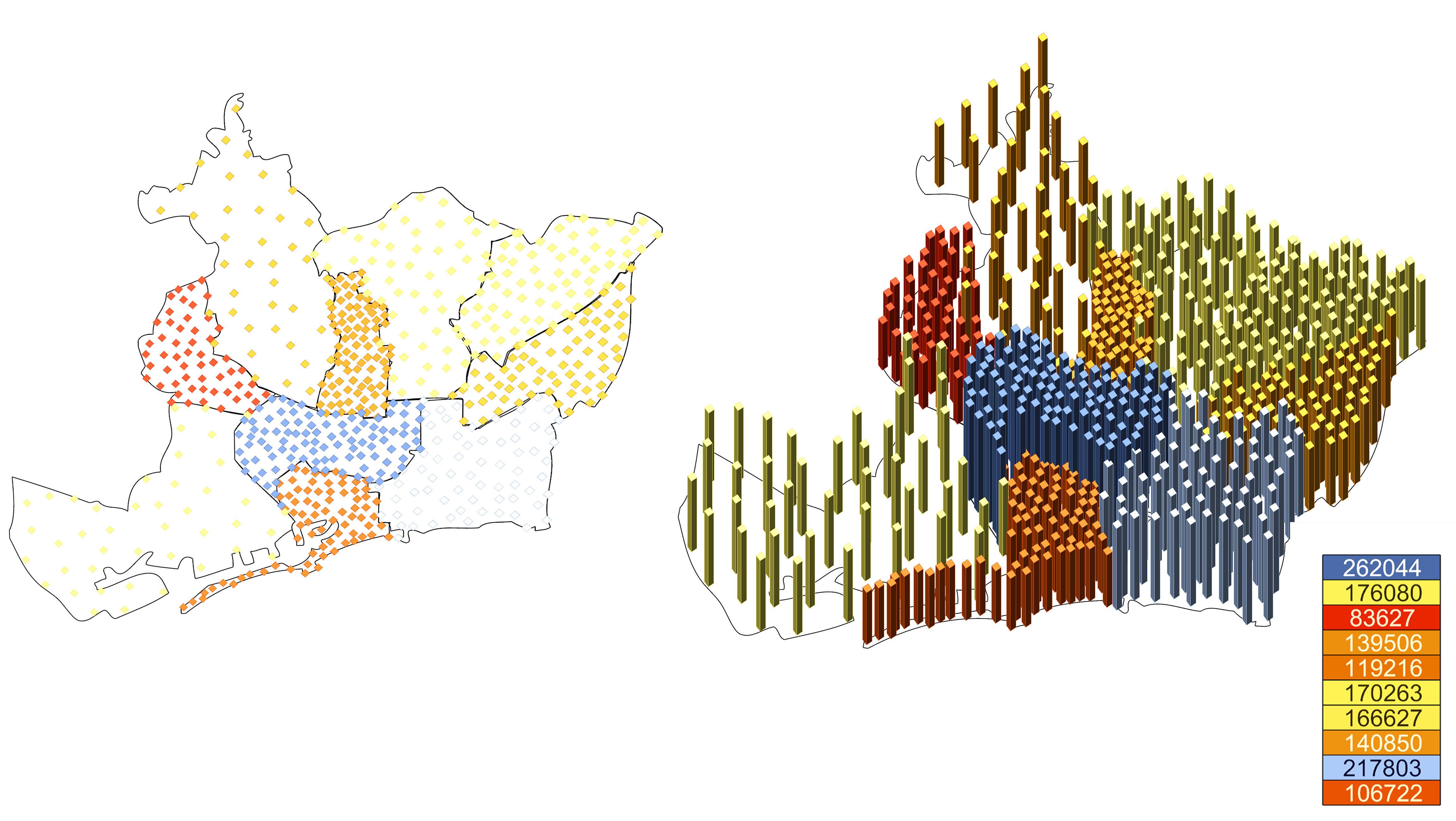
These maps show according to height, colors and names, the population of each district of Barcelona.

In relation with my “Self Sufficient Building Studio” topic – Global warming-, I decided to research about the available biomass in Barcelona. I found this information interesting, because is necessary know how many green areas has the city and each district in order to combat th the CO2 and methane problem.
Speculation
What is the relationship between the number of people killed or affected by earthquakes in comparison with the respective population density of worldwide countries?
Data Mining
The data we collected is composed of three branches:-
1. No. of people effected by earthquakes
http://www.emdat.be/database and http://www.cred.be/
link to data // https://spreadsheets.google.com/pub?key=rG_BjsDwyS2n7DANNH3i5vQ&gid=0
2. No. of people killed by earthquakes
http://www.emdat.be/database and http://www.cred.be/
link to data // https://spreadsheets.google.com/pub?key=rvbbs7uxQc7swJ4RR2BcQfA&gid=0
3. Population density per km squared
http://spreadsheets.google.com/pub?key=tVY51lNaCL9m9xPqf29oFAA&gid=0
Data Visualisation
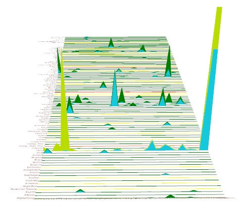
The data visualisation done through Grasshopper is a graphical representation that creates a comparison between the number of people effected by earthquakes and the number of people killed by earthquakes on a yearly basis. The population density is also taken into account in order to understand better if this relates to the number of people effected/killed.
The number of people effected, number of people killed and population density are represented with green, blue and yellow respectively. The bottom part of graph is the number of affected people whilst the top is the number of killed people.
This kind of graphical representation can be used further for our design studio to see differences between population densities and other social factors happening at the same time.