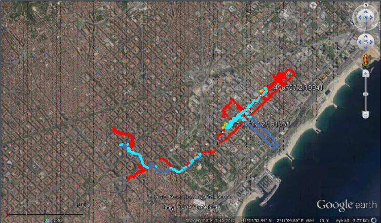
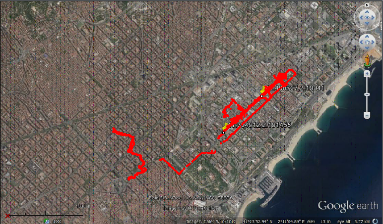
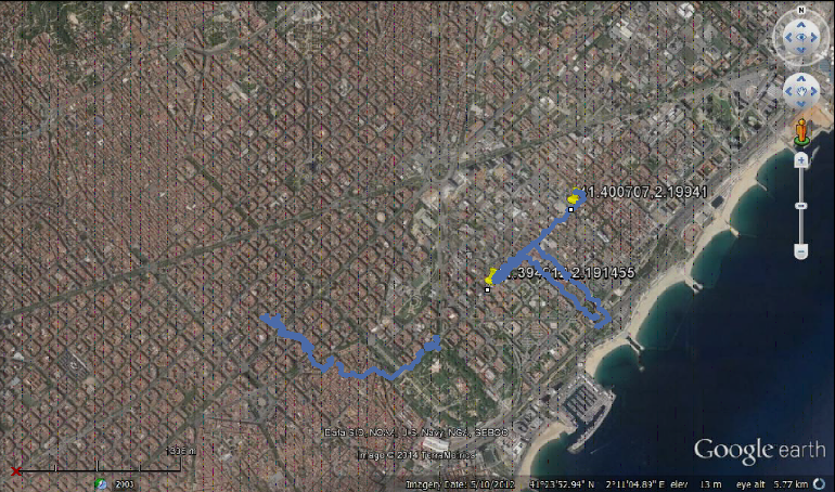
Two sets of data were used in order to understand their common/meeting places.
The data was then visualized in order to get a better understanding of the locations commonly visited in both the tracks.
Track 1 – Red
Track 2- Blue
Overlap -Cyan
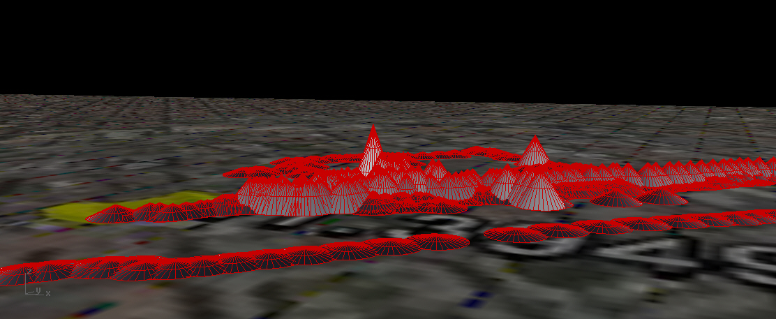

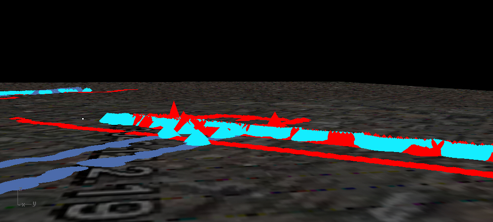
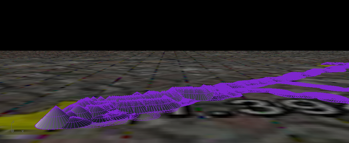
The visualization above is based on the location of the person 1 at a given point in time. The radius of the cone is determined by the aprroximate avg speed (*50 for a clearly view) the person was travelling at. The height indicates the approx elevation at which the individual was (*2 for a better understanding)

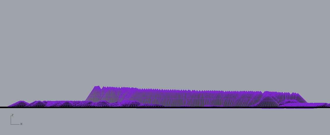
The visualization above is based on the location of the person 2 at a given point in time. The radius of the cone is determined by the aprroximate avg speed (*50 for a clearly view) the person was travelling at. The height indicates the approx elevation at which the individual was (*2 for a better understanding)
Conclusion
