Screenshot from VIDEO
Inspired by data visualization and looking at information as art, this is an experiment to explore the basics of graphically rhythmic visuals using sound as an input and basic geometric shapes to build the visual environment.
CLICK THE IMAGE TO WATCH THE VIDEO
>> CLICK HERE TO WATCH THE VIDEO <<
Library: Minim
Method: FFT / Frequency Spectrum
Song: Game of Love (remix by Nicolas Jaar Album DaftSide) original song by Daft Punk
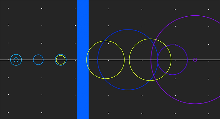
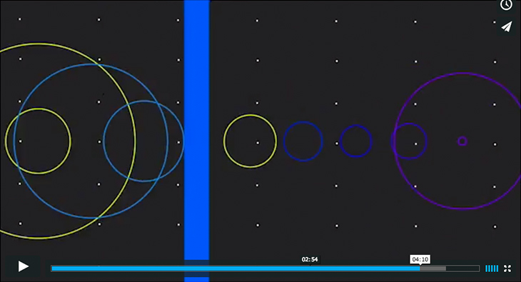
Looking into songs as data, this sketch shows how using the MINIM library from processing can analyze audio to isolate specific frequencies within a spectrum. Then add this properties to specific shapes and create responsive visuals. Using the method described by DDF on this link – http://code.compartmental.net/2007/03/21/fft-averages – to group the frequency bands in the spectrum into 9 bands, where each band represents a range in hertz. This allowed control 9 ellipse shapes to change color or size, or show a grid of points only when the amplitude (loudness) of a range is between two specified values.
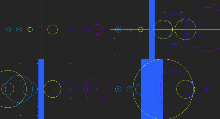
Frequencies divided in 9 bands / 9 shapes to create the graphic representation.