Category Archives: Uncategorized

Lego Brick Process


 The project was inspired by two iconic buildings tods building in Omotesando Tokyo and the bird’s nest in Beijing, designed by two innovative architects: Toyo Ito and Herzog & De Meuron .  The difference is that tods was conceived with the idea of a free façade that is not structurally driven , which gives more freedom in design, whilst the bird’s nest was conceived with the idea that the façade was the structural element that is both functional and beautiful at the same time .  

Tod’s is a substantial L-shaped building that needed to make the most of its narrow facade on Omotesando Avenue, Tokyo’s most prestigious shopping street. Ito’s innovative structure does this through concrete and glass walls in which the tree-shaped concrete limbs are structural, and wrap around the six faces of the building. The visual effect is dramatic .The shape of the concrete limbs is derived from the zelkova trees that line Omotseando Avenue. The architectural power of the non-structural curtain wall in modern architecture was to create the “free facade”. With new technologies for concrete and glass construction, Ito has found a new freedom within a structural wall.

The bird’s nest Construction began on 23 December 2003 and finished in early 2008. To achieve the optimum design, the team relied heavily on parametric design software. This helped to work out the sightlines, the bowl geometry, airflow to keep the grass in good condition, seismic studies and to design the external envelope. While the surface of the structure is simple, the geometry is complex – the calculations were so numerous and complicated that they could not be solved manually. Software was needed to make sure that the web of twisting steel sections fitted together, as they have to twist and bend to follow the surface accurately.

Posted in Uncategorized | Leave a comment

DigiFab_Case Study 2

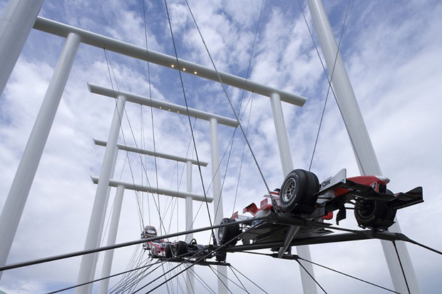
Gerry Judah for Audi Goodwood Festival of Speed Sculpture

gerry-judah-audi-goodwood-speed

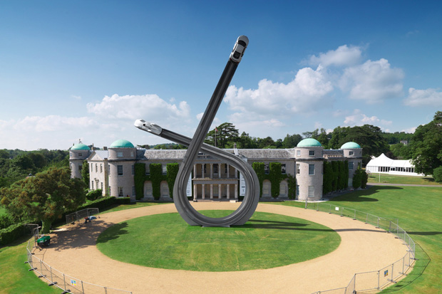
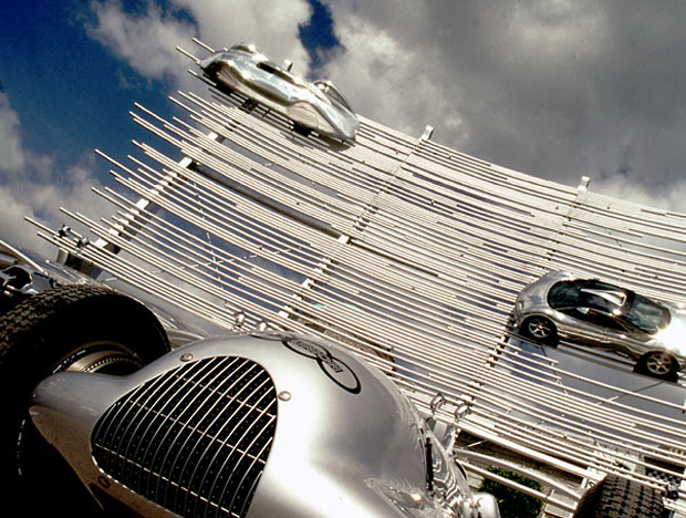
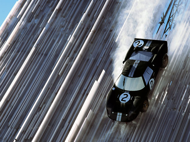
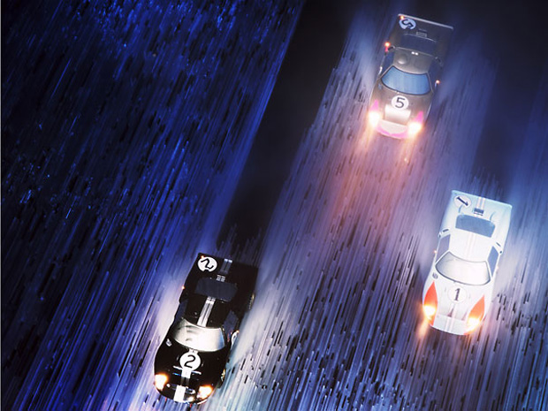
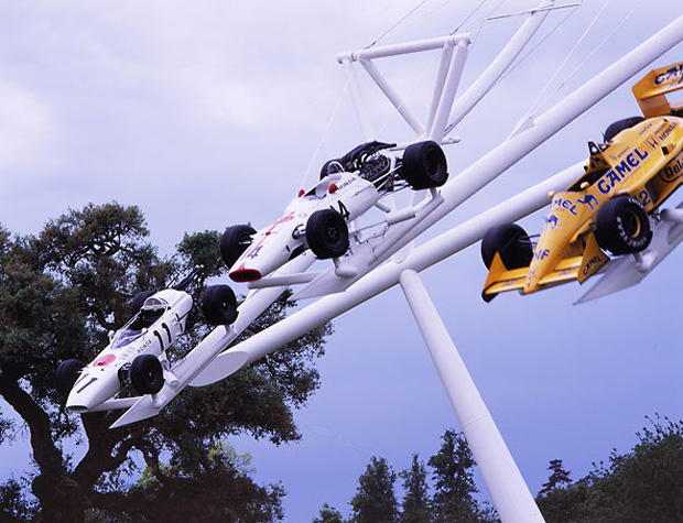
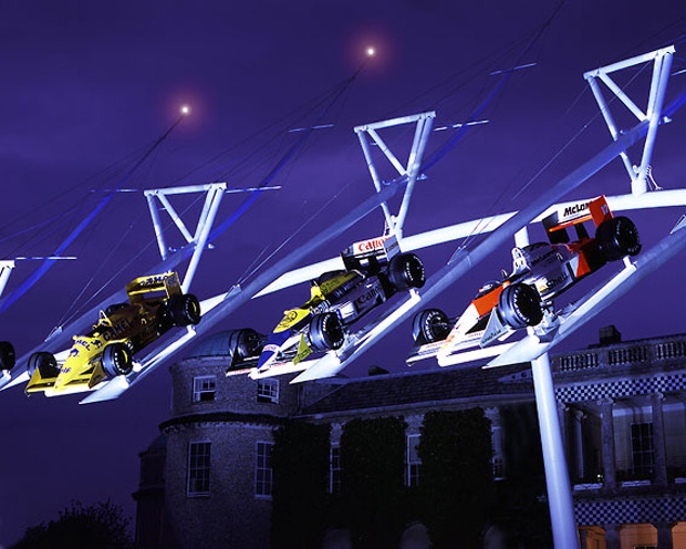
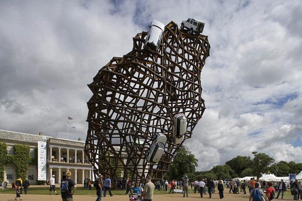
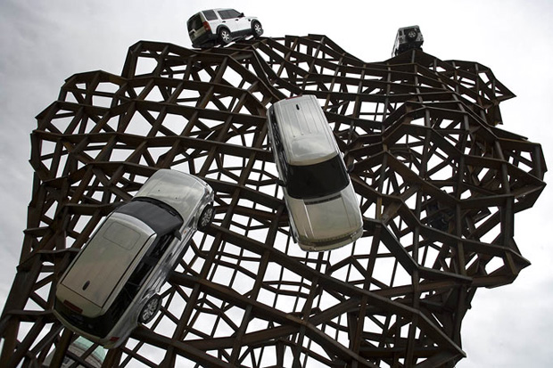
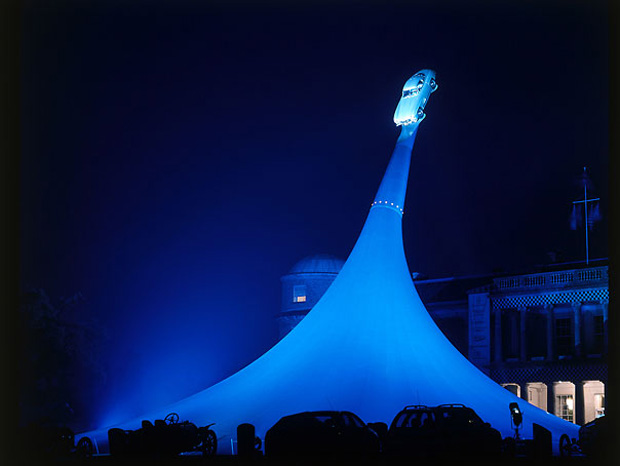
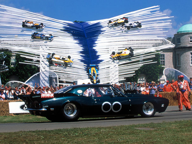
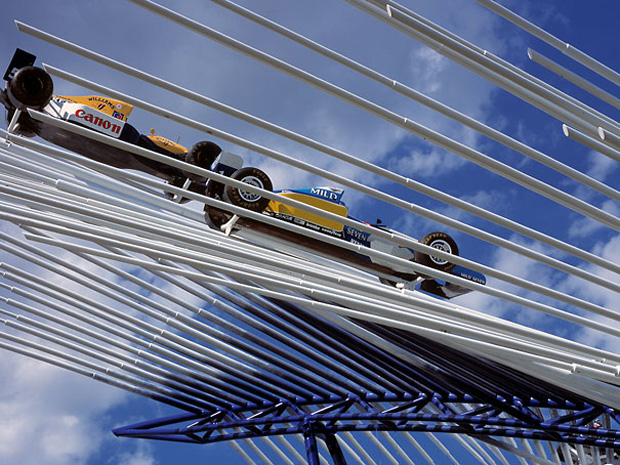
For the yearly event known as the Goodwood Festival of Speed held at the Goodwood estate, the Earl of March commissions a large scale piece of art to commerate the event. This season is no exception as the festival celebrates Audi’s 100th anniversary with this massive 135-foot tall sculputre created by Gerry Judah. The loop design features a tribute to both the present and the past as a 1937 Auto Union steamliner and a contemporary Audi R8 V10 at opposite ends. The self-supporting sculpture weighs a staggering 40 tons and required 100 ton cranes and a team of 12 men taking 4 weeks to construct.

gerry-judah-audi-goodwood-speed

gerry-judah-audi-goodwood-speed

gerry-judah-audi-goodwood-speed

gerry-judah-audi-goodwood-speed

gerry-judah-audi-goodwood-speed

gerry-judah-audi-goodwood-speed

gerry-judah-audi-goodwood-speed

gerry-judah-audi-goodwood-speed

gerry-judah-audi-goodwood-speed

gerry-judah-audi-goodwood-speed

gerry-judah-audi-goodwood-speed


Posted in Uncategorized | Leave a comment

DigiFab_Case Study 1

Memorial for Tree of Knowledge by
m3architecture and Brian Hooper

Australian architects m3architecture and Brian Hooper Architect have completed a memorial to a tree in Queensland, Australia.

Called Memorial for Tree of Knowledge, the project marks the site where the Australian Labour party is said to have been founded in 1891.

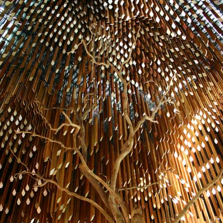
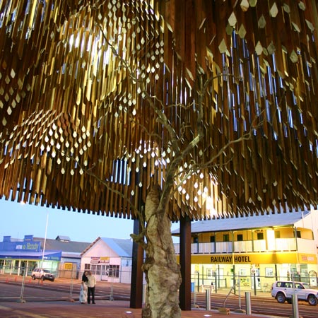
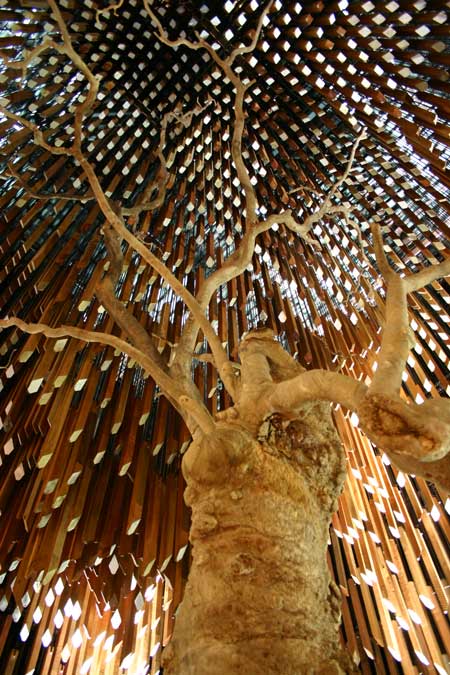
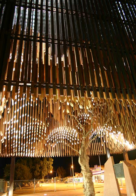
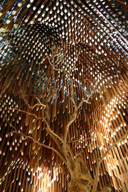
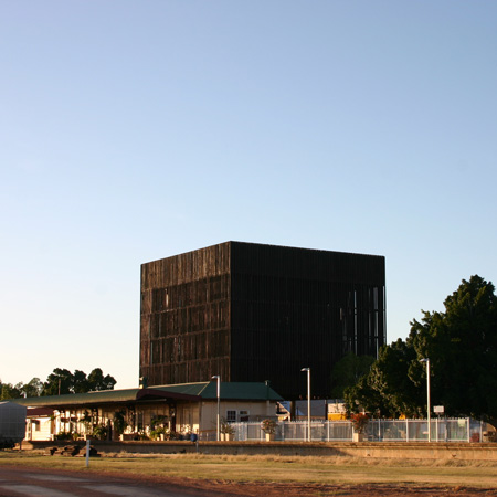
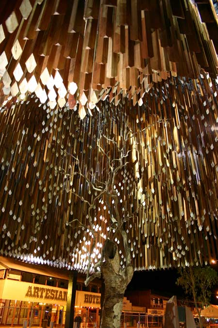
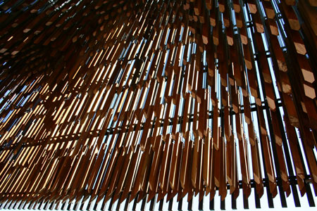
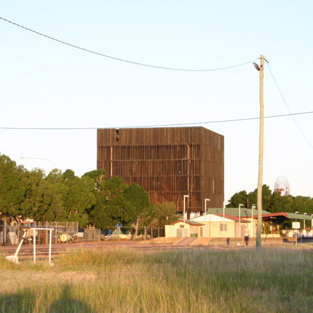
The remaining parts of the dead tree are framed by an 18 metre-high cube-like structure of hanging timber batons, intended to mimic the shape of the tree’s canopy in 1891.

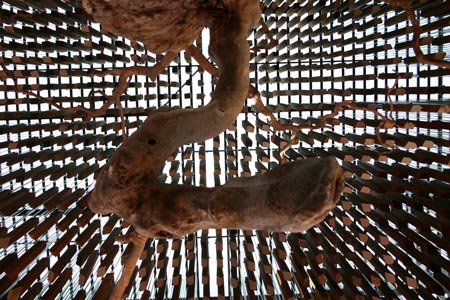
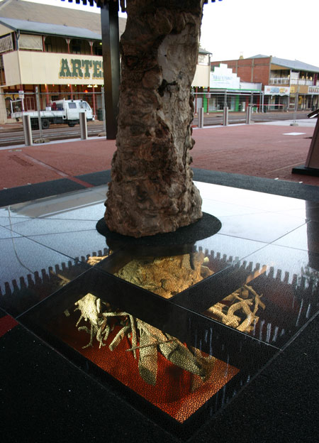
Its root ball is displayed beneath a glass floor panel under this canopy.

Photographs copyright Brian Hopper Architect.

Here’s some more information from the architects:

m3architecture complete memorial for Tree of Knowledge in Australia

Brisbane based architecture practice m3architecture, in association with Brian Hooper Architect, have recently completed a £3 million memorial project for the Tree of Knowledge, accredited as being the birthplace of the Australian Labour party in 1891.

Following the poisoning of the tree in 2006 a memorial was commissioned to commemorate and mark this historical landmark located in the small town of Barcaldine in Queensland, Australia.

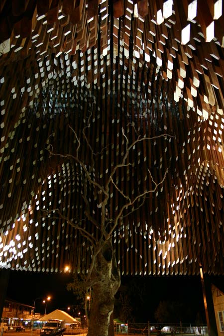
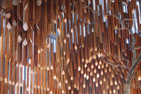
The design forms an 18 metre high steel and timber structure that follows the canopy, in relief, of the old ghost gum tree using 3,600 individual hanging timber slats.

From afar the memorial seems to form a suspended slatted container that surrounds the remaining branches of the original tree; only once visitors stand under the structure they become aware of the canopy that the individual slats form.

m3architecture’s, Michael Lavery explains: “The design was inspired by the way people create and relive memories. The external timbers are charcoaled to create a veil around the memorial space.

This finish and its form reference a place of memory and mourning. The “veil” provides hints to the form and movement inside but it does not fully reveal the impact of this space. This experience is saved for visitors as they enter the shade of the “tree”.”

Premier Anna Bligh who opened the monument said: “This is an extraordinary landmark. I have every confidence we are going to see people from all over Australia and from the world wanting to come here and visit this unique and very beautiful monument”

Visible from the highway the building also serves as a signpost for the town and acts as a gateway to Barcaldine forming part of the entrance way to the railway station. At night the memorial is illuminated and creates a popular meeting place for social exchange. The original root ball of the tree is preserved and showcased to visitors through a glass floor panel located under the canopy.

Posted in Uncategorized | Leave a comment

skin structure building

The “Birds Nest” by Herzog & de Meuron is a great example of a skin like structure that became a reality with the help of computer aided programs as well as human ingenuity. The concept was based off the studies of  Chinese ceramics and was first implemented in the design as ” two independent structures, standing 50 feet apart: a red concrete seating bowl and the outer steel frame around it” (wikipedia, Pasternack 2008, pp. 94) to help hide the stadiums retractable roof structure; which would be later removed from the design after reevaluating the stadiums main focus.  This change dramatically lowered the cost of construction from $500 to $290 million and help the designers pursue other alternatives that increased the stadiums versatility. Grey water collectors were located close to the stadium and after filtering the water, it was redistributed throughout the stadium and the rest of the site. They also, added pipes below the playing surface to heat it in the winters and cool it in the summers. In all, the stadium consist of 91, 000 stadium seats with 11,000 temporary seats. The stadium consisted of 110,000 tons of steel, which was all made in China and was completed by the help of 17,000 workers.

Posted in Uncategorized | Leave a comment

DigiFab:BRICK–MartinFirera/Ma.LauraMolina

IAAC MA 2010-2011// DIGITAL TOOLS AND FABRICATION
OCTOBER 2010

Attended by MARTIN FIRERA, MA. LAURA MOLINA

Intended as an introduction to the advanced digital and fabrication processes, this class is centered on the design and construction of a full scale prototype in a variety of materials.

Additive Processes (Digital Fabrication)

As additive processes We might many examples of models in a diversity of designs such as : architecture design, interior design, product design, fashion design, etc.. just to mention a few.

REFERENCES :

TAICHUNG METROPOLITAN OPERA HOUSE
Toyo Ito

“Architecture has to follow the diversity of society, and has to reflect that a simple square or cube can’t contain that diversity.”

The fluid continuity of the structure reflects the idea that the theatrical arts are spatial arts which combine the body, art, music, and performance. While providing optimum settings for traditional Eastern and Western types of performances, the design by Ito moves beyond the constraints of a traditional Opera House.

The design is an open structure which actively engages its surroundings in all directions and creates opportunities for myriad encounters between high art and popular art, artists and visitors, stage and auditorium, interior and exterior. Ito calls this space the Sound Cave.

The Sound Cave is both a horizontally and vertically continuous network. Even before entering one of the three theatres, the Sound Cave is perceived as a fascinating and flexible “acoustic space,” which, in three dimensions, connects Arts Plaza, workshops, foyers, restaurants etc.

ABU DHABI PERFORMING ARTS CENTRE MODEL
Zaha Hadid

Zaha Hadid described the design of the Performing Arts Centre as “a sculptural form that emerges from a linear intersection of pedestrian paths within the cultural district, gradually developing into a growing organism that sprouts a network of successive branches.

CONCEPT:
Analytical studies of organizational systems and growth in the natural world lead to the set of topologies that are the framework of the Performing Art Centre’s distinct formal language. These natural scenarios are formed by energy being supplied to enclosed systems, and the subsequent decrease in energy caused by development of organized structures. The ‘energy’ of the Performing Art Centre is symbolized by the predominant movements in the urban fabric along the pedestrian corridor and the Cultural Centre’s seafront promenade – the site’s two intersecting primary elements. Branching algorithms and growth-simulation processes have been used to develop spatial representations into a set of basic geometries, and then superimposed with programmatic diagrams and architectonic interpretations in a series of iteration cycles. The primary components of this biological analogy (branches, stems, fruits and leaves) are transformed from abstract diagrams into architectonic design.

PLANE MODEL

THREE DIMENSIONAL PRINTING AT THE ADVANCED MEDIA STUDIO
BY ALEXANDER GIBBONS

THE PHYSICAL MODEL
NYU’s ZCorp Spectrum Z510 builds parts from a proprietary plaster-based powder in layers of a few thousandths of an inch thick. Each layer of powder is spread across a piston-supported bed, and is lowered with each pass and then sprayed with binder using traditional inkjet printheads. Binder is applied to the areas of the cross section that are solid—any areas that are left dry will remain as loose powder that will support the model as it’s built but must be removed when the process is completed. The build bed of the Z510 is 10” x 14” and can extend to a depth of 8”, thus is capable of building parts within a 10” x 14” x 8”

SHOES PROTOTYPING

Naim Josefi and Souzan Youssouf, of Beckmans & Konstfack respectively, designed and modelled the shoes for Selective Laser Sintering (the one with all the powder and the lasers) and produced five pairs for Naim’s “Melonia” collection, shown during Stockholm Fashion Show earlier this month.

The concept for the shoes call for further exploration in ever-developing rapid prototyping processes. The pair envisage a world in which we could produce and recycle such objects in a closed loop.

THE PROJECT

The project consist in the elaboration and fabrication of a skin for a plane brick which should follow some designing requirements so to be printed as a 3Dimensional Object.

Inspired by Toyo Ito’s design for the Suites located in Paseo de Gracia, Barcelona; the structure of the brick has been designed to acquire a similar skin than the one used by this japanese architect in the building. Some similar structures where taken as reference such as the one used by Zaha Hadid in her model suggestion for the Abu Dhabi’s performing Arts Centre. Both examples suggest natural forms, lots of movements and extractions which leave the skin semi open  and allow the light reflection to go inside the model.

Other examples taken as models for the skin of the brick where taken from different designs, not only architectonical, such as the Shoe designed by Naim Josefi and Souzan Youssouf presented in the Stockholm Fashion Week and the Plane designed by Alexander Gibbons. These are examples of sculptural designs which also use natural forms.

MODEL 1
Created from the difference between the primal brick and a box to obtain two boards with the female and male connection emptied shapes. The spaces between the two boards were taken to make a curved and slashed shape inspired by the texture of the Toyo Ito’s building in psg. de Gràcia in BCN.

To create this shape we have set up two loft, the former of a set of four curves and the latter of curves offsetted by the first set; with the difference of these two loft we have obtained the curved shape.

To obtain the cuts on the surface we have just extruded some curves and, with a successive boolean operation, we have achieved our aim. Some procedures were used to lighten the two boards everywhere possible.

MODEL 2

During the first review, it was suggested to work on a continuous and more organic one-shape form for the brick. According to these instructions we created a new brick.

It started with two loft used in Model 01 but now the circles of the connections are included in them. This way the results are two surfaces that can be joined thanks to the tool merge. That’s the external surface.

To obtain the internal surface we have repeated the same process applied to offsetted curves and then “cap”. The texture was created with an operation of array + offset + extrude to have cylinders with different size according to the distance from the center and then, after some handmade corrections using boolean, we have drilled the shape.

To deform further the object we have applied to it a cadge and moved its control points and obtained the final result for the brick.

THE PRINTING AND FINAL PRODUCT

Posted in Uncategorized | Leave a comment

Case Study 2 – Turbulence House

Turbulence House, Steven Holl Architects

Turbulence House’s sculptural form is created by many different metallic elements that Zahner Company Architectural Metals produced using Holl’s digital designs and cnc technology. It is an eco-friendly designed house which uses photovoltaic systems and its shape takes advantage of the wind for its ventilation.

Source: http://www.stevenholl.com/project-detail.php?type=houses&id=53&page=0

Source: http://www.stevenholl.com/project-detail.php?type=houses&id=53&page=0

Posted in Uncategorized | Leave a comment

Case Study 1 – Embryologic house

Embryologic house, Greg Lynn

Greg Lynn’s Embryologic house is characterized by its “blobural” flexible form. It is digititally designed and can take various forms to fit even in the most unusual landscapes. The prototype was produced by cnc machines for the Venice Biennale of Architecture 2000. Greg Lynn uses software tools to produce a non linear, dynamic architecture which is more close to the nature.

Source: Bergdoll Barry, Christensen Peter [2008], Home Delivery, Fabricating the modern dwelling

Source: http://www.time.com/time/innovators/design/gallery_lynn1.html

Source: Bergdoll Barry, Christensen Peter [2008], Home Delivery, Fabricating the modern dwelling

Posted in Uncategorized | Leave a comment

Case Study 2 – Burst *003

Burst *003, System Architects

Burst *003 is based on parametric design and is constructed using contemporary, digital methods which provide the best use of the materials. It consists of an organic frame of linear elements connected by steel X-clips to support its strange form.

Source: Bergdoll Barry, Christensen Peter [2008], Home Delivery, Fabricating the modern dwelling

Source: Hall Peter [2006], “Bursting out”, Metropolis

Posted in Uncategorized | Leave a comment

Case Study 1 – Variomatic house

Variomatic house, Kas Oosterhuis

Kas Oosterhuis’s Variomatic house is an innovating project in which architecture is considered as a dynamic process where the information and its flow are used to shape the final object. It is based on the interactive relation between the house and its user who can define the shape, the dimensions and even the interior of his house. It is digitally designed and can be produced by a milling machine.

Source: Arieff Allison, Burkhart Bryan [2002], Prefab

Source: Minguet Josep [2005], Prefab design

Source: Minguet Josep [2005], Prefab design

Posted in Uncategorized | Leave a comment

Case Study1: 2 examples of designs where the skin is part of the structure

BMW Welt, Munich

Coop Himmelblau proposed this innovative design of Munichs BMW world, which was chosen to be built in December of 2001. Although an effort has been made to blend the building into its surroundings, Munich’s Olympic park, this building undoubtedly catches the eye of the beholder. A 16 000 square meter cloud shape building springs from a double cone. 4000 tons of steel were used to build this structure. Although the cone and the ‘cloud’ are one piece, the cone makes an important contribution to the carrying of the loads. It is furthermore connected to the ringbeam, which in turn carries loads from the roof to the façade. Outside and inside are united by the use of a glass façade.

The open nature of the glass façade brings an abundance of light into the building, which creates a unique interior experience. The cloud-imitating shape of the building adds a fluid and substantial feel to the building, which complements the crispness of the material choice. Within the building, this flow is conserved, resulting in a well-balanced space which is both open and comforting. Design and function is united, the skin of the building being designed in such a way to create a pleasant interior environment both concerning temperature as also air quality and of course light.

Temporary Pavilion [C]space in London

This temporary pavilion was created in honor of the 10th anniversary of the Architectural Association Design Research Lab in London. Alan Dempsey and Alvin Huang collaborated in this shell structure design. The resulting structure was only brought to life temporarily, being displayed on Bedford Square in London until July 2008.

The waffle structure was made of Fibre-C, giving the structure it’s name: [C]space. Fluid and open, the organic shape results both simple and welcoming to the eye. It’s openness unites the inside with the outside. This sensation is reinforced by the unity of the design, in which the skin is the structure, the floor, the walls and the furniture. It was designed bearing in mind criteria such as constructability and effective use of materials. An extra dimension is added to the architecture through the light installations which shine through the skin at night.

Posted in Uncategorized | Leave a comment