LASER CUTTING
CHAIR : HOW TO BUILD – TUTORIAL
This is a graphic tutorial to help us arm step by step the fabricated product.
FINAL PRODUCT


IAAC MAA 2010: Digital Fabrication Class – BLOG
LASER CUTTING
CHAIR : HOW TO BUILD – TUTORIAL
This is a graphic tutorial to help us arm step by step the fabricated product.
FINAL PRODUCT


This work is a collaboration between Ayber Gülfer and Jordi Portell and describes the fabrication process for the Lego-like-brick exercise in the Digital Fabrication Tools class.
The nurbs modell was converted to a mesh and exported as *.stl in order to send it to the fabrication laboratory.
We rendered the modell with Blender 2.54 to see the final result. We assigned materials and lights in order to have a realistic look at the piece before fabricating.
We submited the file to the FabLab and where notified by the assistants that our model had no problems and could be fabricated in the first batch.
We went to the FabLab and recovered our fabricated modell with the colleagues that had their modell fabricated in the same bunch.
Getting rid of the powder.
Last operations before completion.
Our initial idea was to create a form with “minimum structural elements”.
We thought it was something interesting but that it didn’t explore at all the potentiality of the 3d printer additive process.
WeaverBird has come to be our new best friend.
Antonio Atripaldi and Ohad
This Collapsing Volume lamp designed by Studio Dror is built in a similar way, though the process is additive rather than subtractive and it does something you can only do with rapid prototyping: The manufacturer, Materialise.MGX, starts off with a pile of powdered nylon, and then a CNC laser selectively sinters (SLS) parts of the nylon into solid links that are all interlocked.
The only way to create something this complex is rapid prototyping–and laser sintering, to be exact. The process works by sweeping a laser across a pan of powdered nylon; when the lasers hit the nylon, it fuses (“sinters”). The process repeats in layers, until the final product emerges. Thus, you can create interlocking shapes all at once–for example, a chain whose links are completely closed.
When illuminated, the beauty of the complexity of the shape is highlighted through the various effects the light has on the hundreds of squares that make up the collapsible form. The light is diffused in a way that gives the structure a bright, warm glow in the center, which gradually fades into cooler, darker shades on the edges and corners of the cube.
A series of disused buildings from Mumbai’s colonial past set within the Mumbai Race Course are to be converted to form a series of restaurant and bars. The conservation guidelines call for the preservation of the roof profile for three-quarters of the buildings and full conservation for the remaining one-quarter. The interesting aspect of the site, however, lies not in the colonial buildings but in the open spaces covered by mature Rain Trees. These spaces are shaded throughout the year by the thinly wide spread leaves of the Rain Trees, allowing almost the entire proposed program to occur outdoors.
The proposal attempts to continue this idea of a continuously differentiated space, with no clear boundary, into the envelope of the conservation building. A new structure is proposed within the old building envelope. The structural system adopted here is that of a tree-branch. The propagation of the branching system along the longitudinal section of the conserved building is differentiated in its growth along the transverse section. This differentiation reorganizes the old buildings with new dining programs. Therefore each dining program (wine bar, restaurant, pre-function and banquet facilities) is captured within a different spatial volume, defined by the variable degree of the branching structure. When the branches touch the ceiling, the ceiling plane is punctured with a series of openings corresponding to the intersection of the branches with the purlins and rafters. These openings become light coves and slits.
Construction Notes: The construction of the Tote was a complex combination of restoration works for the Heritage Building and the demolition and reconstruction of the the Banquet wing. The tree structure was designed to be a steel truss and the challenge lay in working through the construction system compatible with local skills. The choice of the I-section was based on the fact that the web could be laser cut to ensure dimensional precision, while relying on the skilled fabricators to weld the flanges on and assemble the truss accurately. The truss geometry was altered for smooth branching as opposed to an angular one to reduce the number of weld joints. The success of the installation is that the final product conceals the fabrication method and appears to be a system of curved sections.
PTW ARCHITECTS – ARUP – CSCEC – CCDI
WATER CUBE
The Aquatics Center hosted the swimming, diving and Synchronized Swimming events during the Olympics.
The Water Cube was specially designed and built by a consortium made up of PTW Architects (an Australian architecture firm), Arup international engineering group, CSCEC (China State Construction Engineering Corporation), and CCDI (China Construction Design International) of Shanghai.
Comprising a steel space frame, it is the largest ETFE clad structure in the world with over 100,000 m² of ETFE pillows that are only 0.2 mm (1/125 of an inch) in total thickness. The ETFE cladding allows more light and heat penetration than traditional glass, resulting in a 30% decrease in energy costs.
The outer wall is based on the Weaire–Phelan structure, a structure devised from the natural formation of bubbles in soap lather. The complex Weaire–Phelan pattern was developed by slicing through bubbles in soap foam, resulting in more irregular, organic patterns than foam bubble structures proposed earlier by the scientist Kelvin. Using the Weaire–Phelan geometry, the Water Cube’s exterior cladding is made of 4,000 ETFE bubbles, some as large as 9.14 metres (30.0 ft) across, with seven different sizes for the roof and 15 for the walls.
The structure had a capacity of 17,000 during the games that is being reduced to 6,000. It also has a total land surface of 65,000 square meters and will cover a total of 32,000 square metres (7.9 acres). Although called the Water Cube, the aquatic center is really a rectangular box (cuboid) – 178 metres (584 ft) square and 31 metres (102 ft) high.
Actually it’s a Water Theme Park
http://link.brightcove.com/services/player/bcpid4221754001?bctid=506892713001
MORPHOSIS – THOM MAYNE
COOPER UNION
The Cooper Union for the Advancement of Science and Art, commonly referred to simply as Cooper Union, is a privately funded college in the East Village neighborhood of Manhattan, New York City, United States, located at Cooper Square and Astor Place (Third Avenue and 6th–9th Streets).
A new classroom, laboratory, and studio facility designed by Thom Mayne of Morphosis Architecture, with Gruzen Samton as associate architect, was completed in Summer 2009, replacing the aging Hewitt Academic Building at 41 Cooper Square. In contrast to the Foundation Building, the so-named “New Academic Building” is of modern, environmentally “green” design, housing nine above-ground floors and two basements. The structure features unconventional architectural features, including a full-height Grand Atrium, prevalent interior windows, a four-story linear central staircase, and upper-level skyways, which reflect the design intention of inspiring, socially interactive space for students and faculty. In addition, the building’s design allows for up to 75% natural lighting, further reducing energy costs. Other “green” features in the design include servo-controlled external wall panels, which can be swiveled open or closed individually in order to regulate interior light and temperature, as well as motorized drapes on all exterior windows. In 2010, the New Academic Building became the first academic and laboratory structure in New York City to meet Platinum-level LEED standards for energy efficiency. The building was funded largely by alumni donations, materialized in nameplates and other textual recognition throughout the building.
BRICK #1
andrea debilio – francisco marmolejo
Bio-Mimicry inspiration
Sponges
Brick #1 first model
gh
The project was inspired by two iconic buildings tods building in Omotesando Tokyo and the bird’s nest in Beijing, designed by two innovative architects: Toyo Ito and Herzog & De Meuron . The difference is that tods was conceived with the idea of a free façade that is not structurally driven , which gives more freedom in design, whilst the bird’s nest was conceived with the idea that the façade was the structural element that is both functional and beautiful at the same time .
Tod’s is a substantial L-shaped building that needed to make the most of its narrow facade on Omotesando Avenue, Tokyo’s most prestigious shopping street. Ito’s innovative structure does this through concrete and glass walls in which the tree-shaped concrete limbs are structural, and wrap around the six faces of the building. The visual effect is dramatic .The shape of the concrete limbs is derived from the zelkova trees that line Omotseando Avenue. The architectural power of the non-structural curtain wall in modern architecture was to create the “free facade”. With new technologies for concrete and glass construction, Ito has found a new freedom within a structural wall.
The bird’s nest Construction began on 23 December 2003 and finished in early 2008. To achieve the optimum design, the team relied heavily on parametric design software. This helped to work out the sightlines, the bowl geometry, airflow to keep the grass in good condition, seismic studies and to design the external envelope. While the surface of the structure is simple, the geometry is complex – the calculations were so numerous and complicated that they could not be solved manually. Software was needed to make sure that the web of twisting steel sections fitted together, as they have to twist and bend to follow the surface accurately.
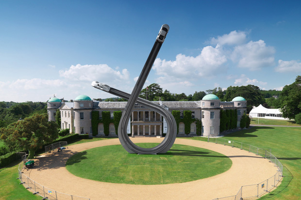
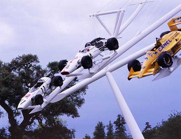
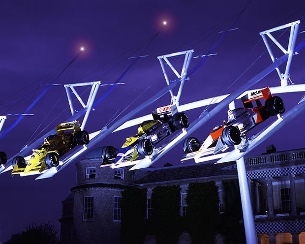
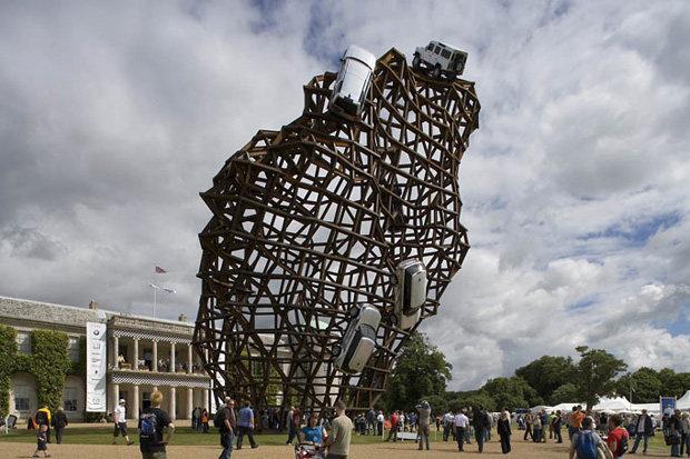
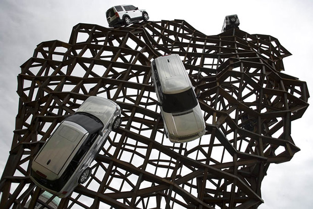
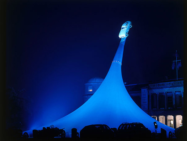
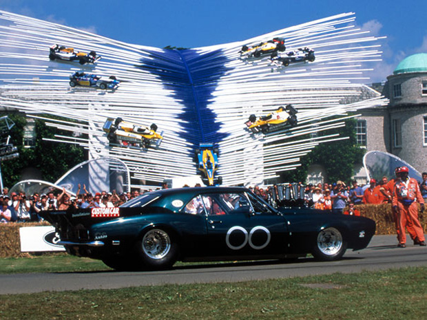
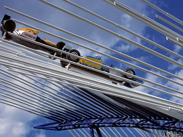
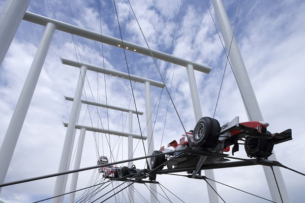
For the yearly event known as the Goodwood Festival of Speed held at the Goodwood estate, the Earl of March commissions a large scale piece of art to commerate the event. This season is no exception as the festival celebrates Audi’s 100th anniversary with this massive 135-foot tall sculputre created by Gerry Judah. The loop design features a tribute to both the present and the past as a 1937 Auto Union steamliner and a contemporary Audi R8 V10 at opposite ends. The self-supporting sculpture weighs a staggering 40 tons and required 100 ton cranes and a team of 12 men taking 4 weeks to construct.
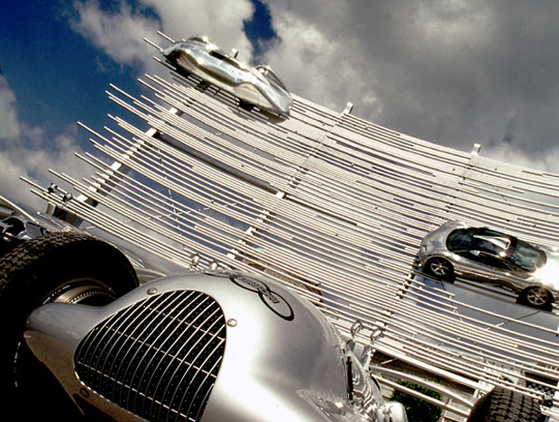
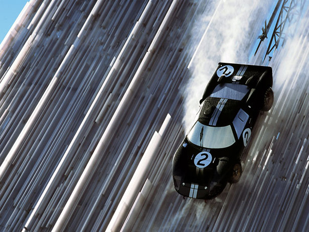
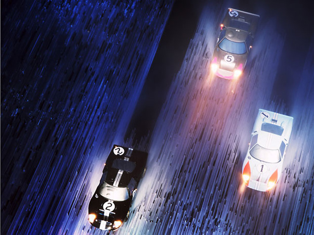
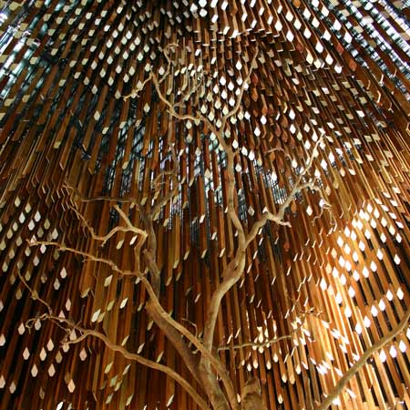
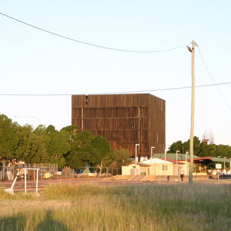
Australian architects m3architecture and Brian Hooper Architect have completed a memorial to a tree in Queensland, Australia.
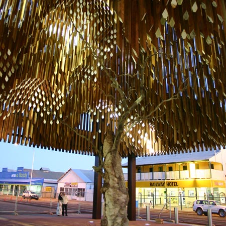
Called Memorial for Tree of Knowledge, the project marks the site where the Australian Labour party is said to have been founded in 1891.
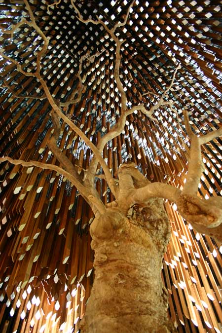
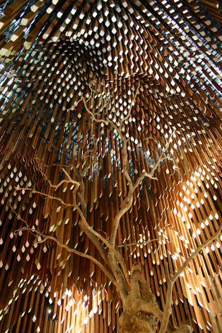
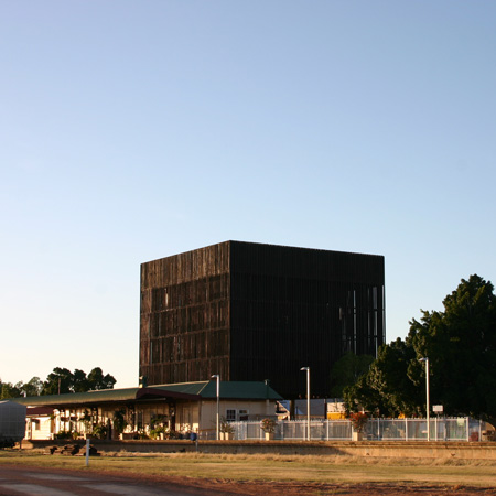
The remaining parts of the dead tree are framed by an 18 metre-high cube-like structure of hanging timber batons, intended to mimic the shape of the tree’s canopy in 1891.
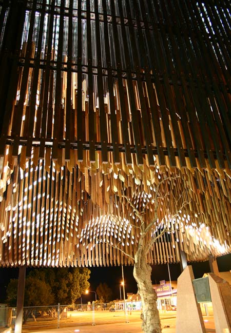
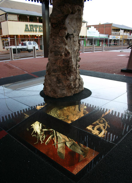
Its root ball is displayed beneath a glass floor panel under this canopy.
Photographs copyright Brian Hopper Architect.
Here’s some more information from the architects:
–
m3architecture complete memorial for Tree of Knowledge in Australia
Brisbane based architecture practice m3architecture, in association with Brian Hooper Architect, have recently completed a £3 million memorial project for the Tree of Knowledge, accredited as being the birthplace of the Australian Labour party in 1891.
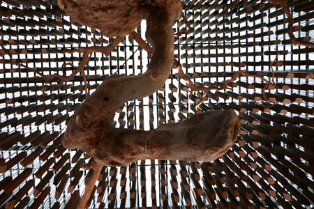
Following the poisoning of the tree in 2006 a memorial was commissioned to commemorate and mark this historical landmark located in the small town of Barcaldine in Queensland, Australia.

The design forms an 18 metre high steel and timber structure that follows the canopy, in relief, of the old ghost gum tree using 3,600 individual hanging timber slats.
From afar the memorial seems to form a suspended slatted container that surrounds the remaining branches of the original tree; only once visitors stand under the structure they become aware of the canopy that the individual slats form.
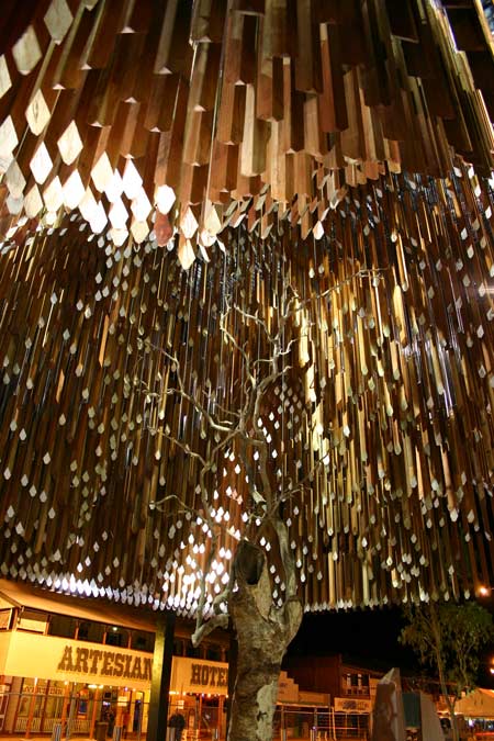
m3architecture’s, Michael Lavery explains: “The design was inspired by the way people create and relive memories. The external timbers are charcoaled to create a veil around the memorial space.
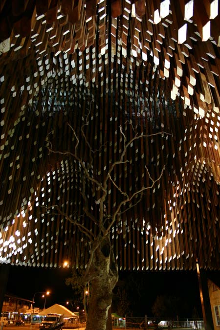
This finish and its form reference a place of memory and mourning. The “veil” provides hints to the form and movement inside but it does not fully reveal the impact of this space. This experience is saved for visitors as they enter the shade of the “tree”.”
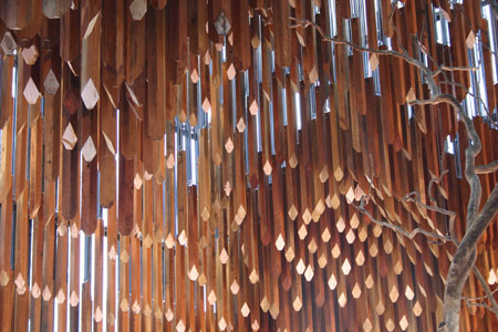
Premier Anna Bligh who opened the monument said: “This is an extraordinary landmark. I have every confidence we are going to see people from all over Australia and from the world wanting to come here and visit this unique and very beautiful monument”
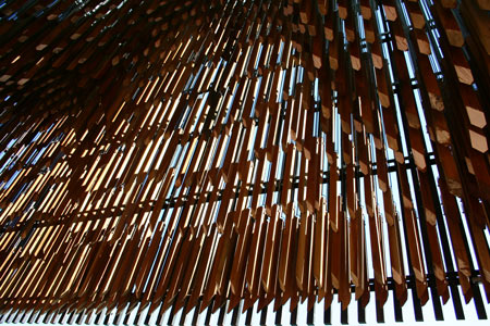
Visible from the highway the building also serves as a signpost for the town and acts as a gateway to Barcaldine forming part of the entrance way to the railway station. At night the memorial is illuminated and creates a popular meeting place for social exchange. The original root ball of the tree is preserved and showcased to visitors through a glass floor panel located under the canopy.
The “Birds Nest” by Herzog & de Meuron is a great example of a skin like structure that became a reality with the help of computer aided programs as well as human ingenuity. The concept was based off the studies of Chinese ceramics and was first implemented in the design as ” two independent structures, standing 50 feet apart: a red concrete seating bowl and the outer steel frame around it” (wikipedia, Pasternack 2008, pp. 94) to help hide the stadiums retractable roof structure; which would be later removed from the design after reevaluating the stadiums main focus. This change dramatically lowered the cost of construction from $500 to $290 million and help the designers pursue other alternatives that increased the stadiums versatility. Grey water collectors were located close to the stadium and after filtering the water, it was redistributed throughout the stadium and the rest of the site. They also, added pipes below the playing surface to heat it in the winters and cool it in the summers. In all, the stadium consist of 91, 000 stadium seats with 11,000 temporary seats. The stadium consisted of 110,000 tons of steel, which was all made in China and was completed by the help of 17,000 workers.